Table of Contents
Your resume has just a few seconds to make a good first impression, and your font plays a bigger role than you might think. A hard-to-read or outdated resume font can turn recruiters away before they even notice your skills.
The good news? Choosing the right font is easy once you know what works. In this guide, we’ll walk you through the 15 best resume fonts and show you how to pick one that helps you look professional and job-ready.
Want to save time and have your resume ready in 5 minutes? Try our Resume Builder. It’s fast and easy to use. Plus, you’ll get ready-made content to add with one click.
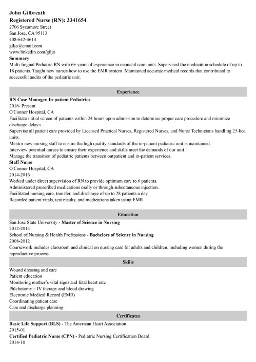
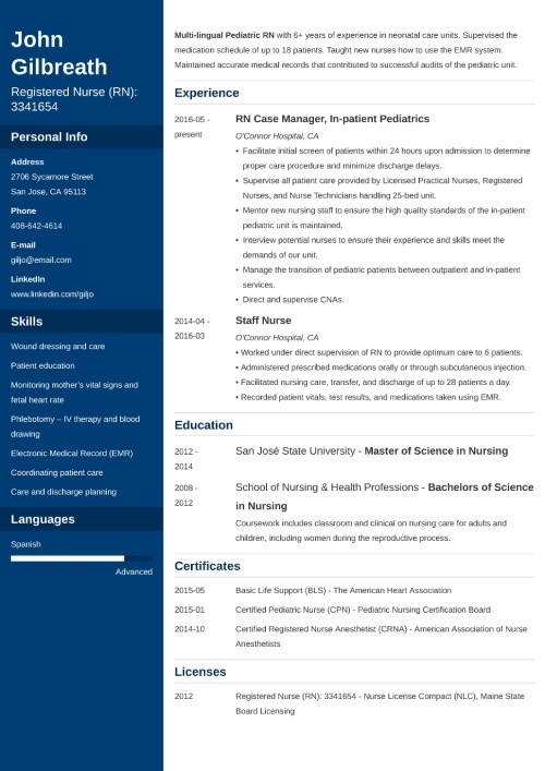
Sample resume made with our builder—See more resume examples here.
One of our users, Chris, had this to say:
You cannot go wrong with Zety. The company does best at enhancing your resume and helping market yourself better to land the job you love.
What Is the Best Font for a Resume?
The best font for a resume is simple, easy to read, and professional. Classic fonts like Arial, Calibri, and Times New Roman are popular because they’re widely available and easy for both recruiters and applicant tracking systems (ATS) to scan.
That said, your choice isn’t limited to these typefaces. There are many strong options to pick from. The key is to prioritize readability so your resume is ATS-friendly and makes a great impression on employers.
What’s the Difference Between Serif & Sans-Serif Fonts?
The main difference between serif and sans-serif fonts is that serif fonts have small decorative lines at the ends of letters, while sans-serif fonts do not.
Serif fonts, like Times New Roman, often look more traditional and formal, and tend to work better in print. Sans-serif fonts, like Arial and Calibri, have a clean, modern style that’s easier to read on screens.
Both can work well on a resume, but sans-serif fonts are usually the safer choice because they look clear on most devices and are easier for ATS to scan.
Top 15 Resume Fonts
Let’s go over the 15 best fonts for your resume, both in serif and sans-serif styles.
1. Calibri
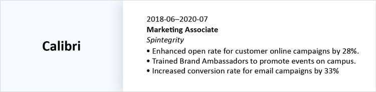
Calibri was designed to replace Times New Roman as the default font in Microsoft Office, making it one of the most familiar fonts to employers. It has a minimal, modern look without extra decoration, which helps your resume feel polished.
Because it works well on screens and in print, Calibri is a reliable choice for most job seekers.
Works best for:
- Business and corporate roles
- Technology and IT
- Marketing and communication
- Healthcare and education
- Customer service and sales
Pros & Cons
Pros
- Calibri is a default font in Microsoft Office, so it usually displays correctly on any device. It looks professional, is easy to scan, and works well for both printed and digital resumes.
Cons
- Because Calibri is so widely used, many job seekers choose it. This could make your resume look similar to others and less visually distinctive.
2. Cambria
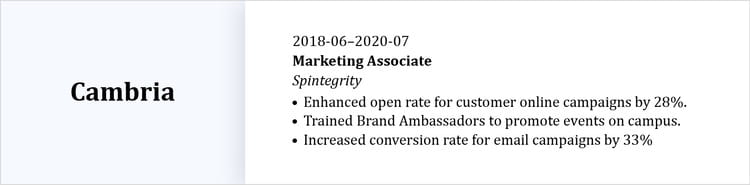
Cambria was commissioned by Microsoft and released in 2004. This serif font was designed to look clear on screens and sharp at small print sizes, making it a strong choice for resume content.
It’s also an excellent option for writing cover letters, thanks to its professional appearance and detail-oriented design.
Works best for:
- Education and academia
- Law and legal services
- Government and public service
- Finance and accounting
- Healthcare administration
- Publishing, writing, and editing
Pros & Cons
Pros
- It’s great for reading small print and achieving a more traditional look.
Cons
- Because of its traditional look, it may not work as well for modern jobs.
3. Helvetica
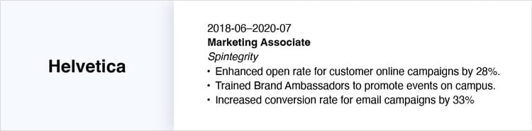
Helvetica is a modern sans-serif font known for its readability and timeless style. Its sleek look has made it a favorite in design and branding—so much so that both the New York City subway system and companies like BMW use it for signage.
Helvetica works especially well for writing resumes that need a contemporary, stylish touch without sacrificing clarity.
Works best for:
- Advertising and marketing
- Graphic design and creative roles
- Architecture and interior design
- Technology and startups
- Media and publishing
Pros & Cons
Pros
- Many professionals rank Helvetica among the more beautiful sans-serif fonts, making it a great choice for design-oriented job seekers.
Cons
- MacBooks come preloaded with Helvetica, but it isn’t found in Microsoft Word. Users without MacBooks would have to buy it.
4. Georgia

Georgia is a classic serif font designed by Microsoft in the early 1990s and remains a popular choice today. Known for its readability on screens, it’s used by the New York Times online and major companies like Yahoo and Amazon.
Georgia’s clean look makes it ideal for resumes and PDFs.
Works best for:
- Publishing and journalism
- Education and academia
- Finance and banking
- Law and legal services
- Corporate business roles
Pros & Cons
Pros
- Georgia is widely available across platforms, making it easy to use for any resume. It’s a strong alternative to other serif fonts like Times New Roman. The 2013 update also refreshed its design, keeping it modern and highly readable.
Cons
- Georgia is very popular, so your resume may blend in with others. Its 19th-century-inspired style may not stand out in creative or trend-focused industries.
5. Verdana
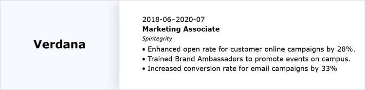
This sans-serif font, created by Matthew Carter for Microsoft, is a companion to Georgia. It was designed for maximum readability on screens, even at small sizes, which makes it ideal for digital resumes, PDFs, and cover letters.
Its professional yet approachable look makes it a solid choice for a wide range of careers and simple resume templates.
Works best for:
- Technology and IT
- Marketing and communications
- Administrative and office roles
- Customer service and support
- Healthcare administration
Pros & Cons
Pros
- Verdana is optimized for on-screen small print, making it perfect for situations where you need to fit more content without sacrificing readability.
Cons
- Verdana is understated, so it may not give your resume a highly distinctive or creative look. For roles in creative fields, a more unique font might make a stronger impression.
6. Garamond
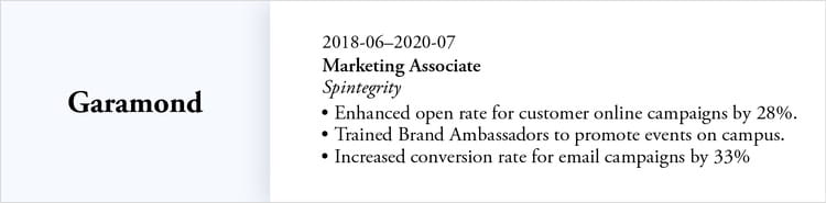
Garamond is a classic serif font with roots in 15th- and 16th-century type designs. Its elegant and timeless style makes it a favorite for printed resumes.
Garamond’s sharp serifs and moderate stroke contrast also improve readability at smaller sizes, making it easy to fit more content on a page.
Works best for:
- Publishing and journalism
- Education and academia
- Law and legal services
- Finance and banking
- Corporate business roles
Pros & Cons
Pros
- Garamond is a favorite among designers and professionals who want a resume that looks elegant. It conveys a sense of sophistication without being overused.
Cons
- Because of its historic style, it may feel too traditional for more modern or creative roles. In fast-paced, trend-focused industries, a more contemporary font might make a stronger impression.
7. Trebuchet MS
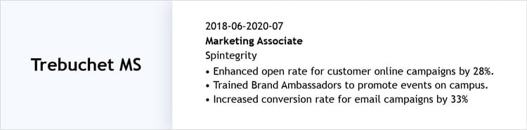
Trebuchet MS’s rounded shapes and subtle irregularities give it an approachable feel without sacrificing readability. Its wide, open letters and clean lines make it easy to scan, whether your resume is viewed on screen or in print.
Trebuchet MS works especially well for modern resume templates that need to balance professionalism with a slightly creative, welcoming look.
Works best for:
- Marketing and communications
- Customer service and client-facing roles
- Technology and startups
- Education and training
- Nonprofit and community-focused organizations
Pros & Cons
Pros
- Trebuchet MS is widely available, as Microsoft released it as a core web font and is also accessible on platforms like Google Docs.
Cons
- Some advanced typographic features, such as small caps and text figures, are available only in the commercial version, Trebuchet Pro.
Pro tip: All of Zety’s resume templates have font options optimized for ATS and hiring managers’ ease. No need to guess if it works or not, simply choose the one that fits your industry and shows off your style.
8. Lato
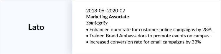
Łukasz Dziedzic, a Polish typeface designer, created the Lato font for a large corporate client. It was designed to feel both professional and approachable.
This makes Lato an excellent choice for resumes that need a contemporary look while remaining easy to read. Its clarity and versatility work well for both on-screen and printed documents.
Works best for:
- Technology and startups
- Marketing and communications
- Customer service and client-facing roles
- Creative industries
- Education and nonprofit organizations
Pros & Cons
Pros
- Lato is open-source under the SIL Open Font License, so you can download and use it for free. Plus, it’s widely available in the Google Fonts library, making it easy to access across different platforms and devices.
Cons
- Lato is not a standard Microsoft Word font, so there’s a small chance it may not display correctly if a hiring manager opens your resume on a system that doesn’t have it installed.
9. Book Antiqua

Book Antiqua exudes refined elegance, making it an excellent choice for candidates who want a classic look. Its well-spaced letterforms enhance readability, even in dense blocks of text.
This serif font strikes a balance between sophistication and accessibility, making it a versatile option for a range of industries.
Works best for:
- Education and academia
- Law and legal services
- Publishing and journalism
- Finance and banking
- Corporate business roles
Pros & Cons
Pros
- Book Antiqua is a Microsoft version of the classic Palatino font, so it’s widely available across most operating systems and office programs.
Cons
- Because it’s based on humanist designs from the Italian Renaissance, Book Antiqua can feel old-fashioned. While this works well for conservative industries, it may not be the best choice if you want a trendy or highly creative look.
10. Didot
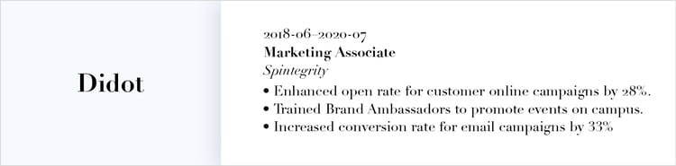
Didot is a high-contrast serif font with a sophisticated style. Its refined letterforms give your resume a polished appearance, making it ideal for luxury-focused industries.
While not as classic as Garamond, Didot stands out for its upscale feel, adding a touch of personality to your resume without sacrificing readability.
Works best for:
- Fashion and luxury brands
- Marketing and advertising
- Creative industries
- Art and photography
- High-end retail or lifestyle brands
Pros & Cons
Pros
- Didot is widely associated with elegance and luxury, making it a great choice for unique resume templates.
Cons
- Didot is a premium font, so you’ll need to purchase it to use it on your resume. Additionally, its decorative style can become overwhelming if overused, so it’s best applied carefully to maintain readability and professionalism.
11. Roboto
Roboto is a geometric sans-serif font released by Google in 2011. Its balanced letterforms and excellent readability at multiple sizes make it ideal for digital-first resumes, online portfolios, and PDFs.
The font’s professional yet approachable design makes it a great choice for minimalist resume templates.
Works best for:
- Technology and IT
- Marketing and communications
- Startups and creative agencies
- Education and training
- Customer service and client-facing roles
Pros & Cons
Pros
- Roboto is modern and highly versatile, working well across all digital formats. It’s fully compatible with Android, Google Docs, and other platforms.
Cons
- Because Roboto is so widely used in tech and digital industries, your resume may blend in with others if you’re trying to make a standout impression.
12. Tahoma
Tahoma is a humanist sans-serif font released by Microsoft in 1994, known for its compact design. Its open letterforms and tight spacing make it ideal for fitting more content on a resume.
Tahoma’s style works well for modern resumes, cover letters, and other professional documents.
Works best for:
- Technology and IT
- Administrative and office roles
- Customer service and support
- Marketing and communications
- Education and training
Pros & Cons
Pros
- Tahoma is highly readable even at small sizes, making it ideal for text-dense resumes.
Cons
- The font’s straightforward, utilitarian style may feel plain or overly common in creative industries.
13. Palatino
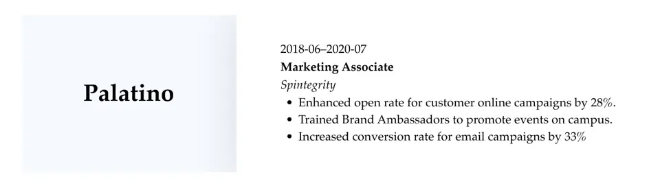
Designed in the 1940s, this serif font is inspired by Renaissance calligraphy. Its elegant letterforms, balanced proportions, and open spacing make it highly readable.
Works best for:
- Education and academia
- Law and legal services
- Publishing and journalism
- Finance and banking
- Corporate business roles
Pros & Cons
Pros
- Palatino is professional and highly readable, making it a reliable choice for both printed and digital resumes. Its classic design conveys credibility and sophistication.
Cons
- Because it’s a traditional serif font, Palatino may feel too conservative for creative or modern industries.
14. Times New Roman
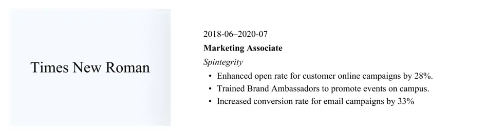
Times New Roman is a classic serif font designed in 1931 for The Times. Its formal design makes it a reliable choice for traditional industries and professional documents where readability and credibility are essential.
Works best for:
- Law and legal services
- Finance and banking
- Education and academia
- Government and public service
- Corporate business roles
Pros & Cons
Pros
- Times New Roman is universally recognized, making it a safe and dependable choice for conservative industries like law, finance, and government.
Cons
- Times New Roman can feel overdone or outdated at times, especially in modern or creative industries.
15. Arial
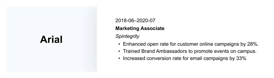
Arial is a versatile sans-serif font known for its clean, simple design and excellent readability across both digital and print formats. Its straightforward appearance makes it a practical choice for professional documents.
Arial’s familiarity and clarity make it a safe, reliable option for a wide range of industries and career levels.
Works best for:
- Technology and IT
- Marketing and communications
- Administrative and office roles
- Customer service and client-facing roles
- Education and training
Pros & Cons
Pros
- Arial’s widespread use and universal availability ensure your resume displays correctly on virtually any device or platform.
Cons
- Because Arial is so common, it can feel generic and may not help your resume stand out visually.
Creating a resume with our builder is incredibly simple. Follow our step-by-step guide and use content from Certified Professional Resume Writers to have a resume ready in minutes.
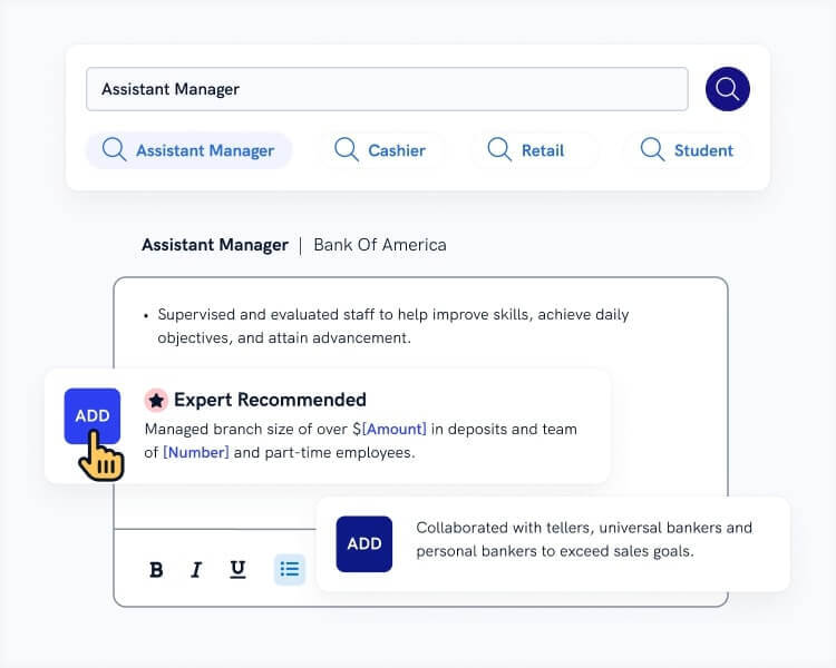
When you’re done, Zety’s Resume Checker will score your resume and tell you exactly how to make it better.
How to Choose the Best Font for Your Resume
To choose the right resume font, consider your industry, ATS requirements, and how much information you plan to include on the page. The font you choose should work well on both screens and paper and help your resume stand out without looking cluttered or gimmicky.
Here are some quick tips to guide your choice:
- Prioritize readability. Pick a font that’s clear at small sizes and easy to scan. Avoid overly decorative or script fonts.
- Match your industry. Use classic serif fonts (like Times New Roman, Garamond, or Palatino) for conservative fields, and clean sans-serif fonts (like Calibri, Arial, or Lato) for modern or creative roles.
- Stick to one font. Use one font for headings and body text to keep your resume cohesive. Too many fonts can look messy.
- Keep it professional. Avoid novelty or cartoonish fonts, as they can distract from your experience and professional skills.
- Check compatibility. Make sure the font displays correctly across devices and software. PDF resumes are safest for preserving formatting.
- Consider ATS readability. Most employers use ATS to screen resumes. Stick to standard fonts to avoid errors when your resume is parsed.
Fonts to Avoid
Avoid fonts that are hard to read, overly decorative, or unprofessional, because they can distract from your work experience and may even confuse ATS.
Here’s a list of fonts to avoid:
- Comic Sans: Too casual and playful; not taken seriously
- Papyrus: Decorative and outdated; can look unprofessional
- Curlz MT: Overly whimsical; hard to read and distracting
- Chiller: Scary or dramatic styling; not suitable for professional documents
- Brush Script/Lucida Handwriting: A script font, which makes it hard to scan and may not display well on all devices
- Impact/Decorative Display Fonts: Designed for posters or signage, making it too bold and flashy for resumes
- Any novelty or themed fonts: Appears unprofessional unless used sparingly for highly creative roles
5 Resume Font Formatting Tips
Keep in mind these font formatting tips when creating your resume:
- Stick to 10–12 pt. for body text. Your resume font size should be large enough to read easily but small enough to keep your resume to one page.
- Use a larger font for headings. Make section titles stand out by using 14 or 16 pt. while keeping them consistent across your resume.
- Limit font styles. Use one font for body text and optionally one complementary font for headings.
- Emphasize clarity. Choose fonts with clear letterforms and spacing.
- Maintain consistent spacing. Keep line spacing between 1.15 and 1.5 and ensure bullet points, margins, and headings are uniform to enhance overall clarity.
Key Takeaways
You’re ready to choose your resume font and start writing! As you do so, remember these key points:
- The best resume font is professional and easy to read, ensuring your resume passes ATS and stands out for the right reasons.
- Serif fonts like Garamond or Times New Roman have decorative lines at the ends of the letters and work well for traditional industries.
- Sans-serif fonts like Calibri or Lato lack embellishments, making them simpler and more suitable for modern or creative fields.
- Keep your resume font size between 10 to 12 pt. for body text and 14 to 16 pt. for headings.
- Stick to one or two complementary fonts to maintain a cohesive look.
- Avoid decorative, novelty, or overly stylized fonts that distract from your experience.
- Ensure your font displays correctly across devices and applicant tracking systems.
- Readability and clarity are more important than flair—your resume should be easy to scan.
Frequently Asked Questions
What is the best font for a resume?
The best font for a resume is professional, easy to read, and well-suited to your target industry. For more traditional fields, pick a serif font. On the other hand, creative or modern industries prefer sans-serif fonts.
Both font types work well for both digital and printed resumes and are compatible with ATS systems. Here are some of them:
Serif font:
- Garamond
- Palatino
- Georgia
Sans-serif font:
- Arial
- Calibri
- Roboto
Should I use Calibri or Arial for a resume?
Both Calibri and Arial are safe choices for a resume. Calibri has a modern, rounded look, while Arial is clean and more linear. Either works well for digital and printed resumes, and your choice should reflect your industry and personal preference.
Calibri is often preferred for modern roles, while Arial is slightly more neutral. If you’re applying for a traditional field like publishing, you could try Times New Roman or Georgia instead.
Which font style is considered the most professional for a resume?
Serif and sans-serif fonts are considered the most professional for resumes. Serif fonts like Times New Roman or Garamond convey tradition and formality, while sans-serif fonts like Calibri, Lato, or Arial offer a modern look.
The key is readability, compatibility, and appropriateness for your industry. Avoid overly decorative or script fonts to maintain a professional impression.
What is an unprofessional font for a resume?
Unprofessional resume fonts include decorative, novelty, or script styles such as Comic Sans, Papyrus, Curlz MT, Chiller, or Brush Script. These fonts are hard to read, look too casual, and can distract from your skills.
Stick to serif or sans-serif fonts to ensure clarity, professionalism, and ATS compatibility.
What’s the most eye-catching font?
The most eye-catching fonts are neat, modern, and bold without being overly decorative. Fonts like Didot or Helvetica stand out while remaining professional.
Use them sparingly for headings or your name to draw attention, but keep body text in a more standard font like Calibri, Arial, or Garamond for readability.
About Zety’s Editorial Process
This article has been reviewed by our editorial team to make sure it follows Zety’s editorial guidelines. We’re committed to sharing our expertise and giving you trustworthy career advice tailored to your needs. High-quality content is what brings over 40 million readers to our site every year. But we don’t stop there. Our team conducts original research to understand the job market better, and we pride ourselves on being quoted by top universities and prime media outlets from around the world.
Share: