CV Layout: How to Lay Out a Professional CV [5+ Examples]
Create your CV nowCV layout can make or break your job application.
Consider this:
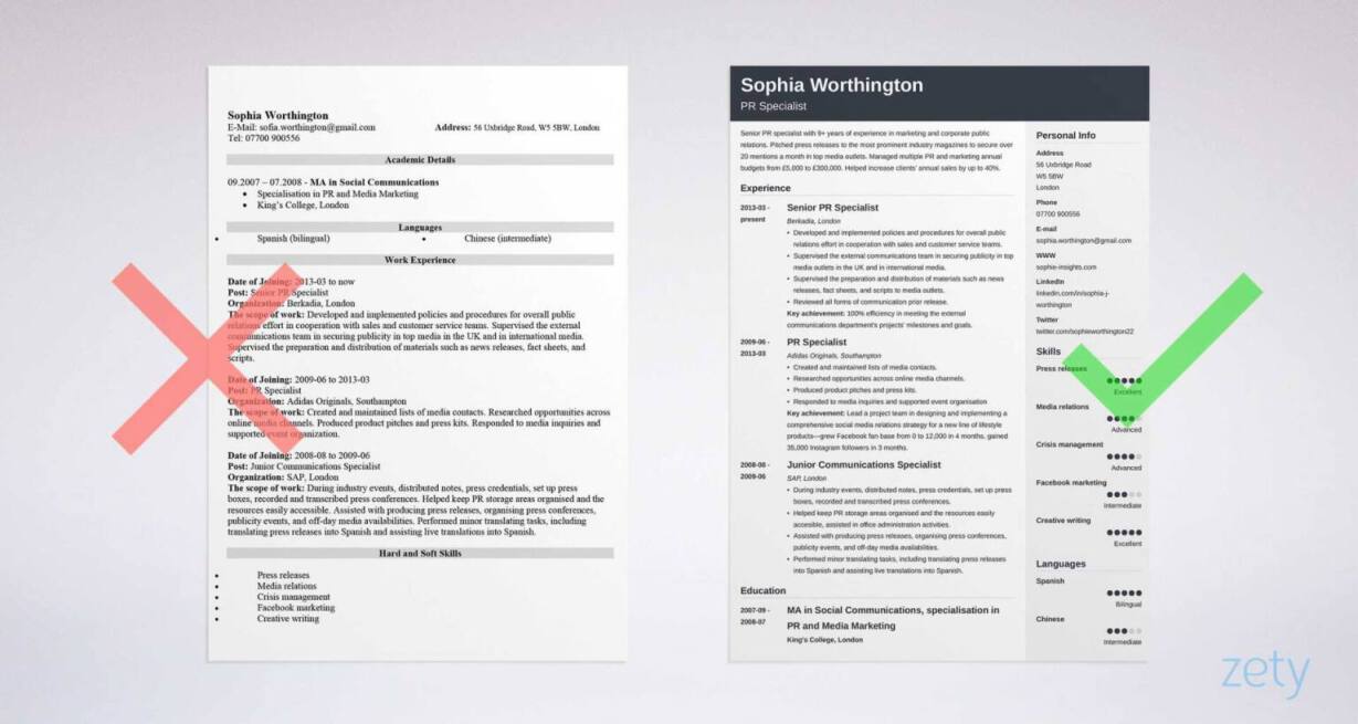
Would you come to a job interview in your pyjamas? Of course you wouldn’t. Well, a sloppy CV layout will send the exact same message—that you don’t care for the job and don’t respect the company.
Let’s make sure that doesn't happen—
This guide will give you expert tips and advice on:
- How to find the best CV layout in order to come across professionally and get more interviews.
- What the best CV layouts are for different style preferences that will allow for you to create a CV unique to you.
- What the three main CV formats are and which one will have you putting your best foot forward in a sea of other candidates.
Now let’s get to creating!
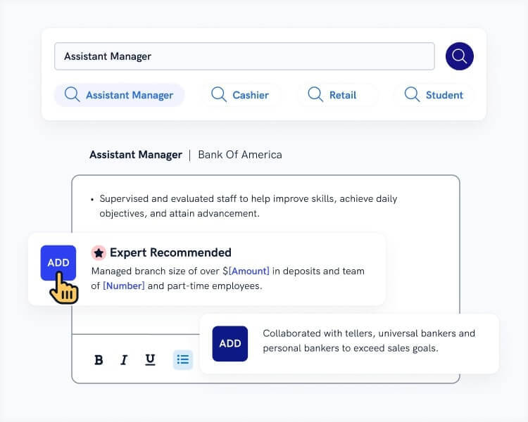
Want to save time and have your CV ready in 5 minutes? Try our CV builder. It’s fast and easy to use. Plus, you’ll get ready-made content to add with one click. See 20+ CV templates and create your CV here.
Sample CV made with our builder—See more CV samples here.
Looking for even more CV advice? Read more here:
- How to Write a CV [Professional UK Examples]
- 20+ Job Winning CV Tips and Advice
- Best CV Format for Job Hunting Success
- Skills Based CV Format [Complete Guide]
- How to Write a CV Personal Statement [CV Profile Examples]
- Key Skills to Put on a CV [Best List of CV Skill Examples]
- Student CV Example & Template
- Graduate CV Example & Template
Expert Curated Video Content
If you prefer watching, our Certified Professional CV Writer, Caio, will explain in detail how to lay out a CV!
1. How to Lay Out a CV
A CV layout is standardised: your name and contact details go on top, followed by a personal statement, experience, education, and skills. Hobbies and interests are optional. There's a growing trend to make the CV one page long, but for more experienced candidates two and even three pages are safe.
1. Choose the right CV font.
Your CV font should be crisp and easy to read. Shy away from overly artistic or illegible fonts. The ideal CV font size is between 11 and 12 as far as the body of your CV is concerned.
Headings and section titles should be slightly bigger in order to differentiate between sections. A font size of 14–16 should do the trick.
A common question is whether 10-point font is too small. Generally speaking, it is a little too small and makes your CV harder to read. That said, it is quite handy if you include any supporting information in your CV (e.g. workplace location) that doesn’t need to be at the forefront.
There are a variety of professional fonts to choose from for the layout of your CV. Here’s a list of the best CV fonts you can use: Arial, Helvetica, Tahoma, Calibri, Verdana, Garamont, Cambria, Times New Roman, Georgia or Bookman Old Style.
2. Tailor your CV margins.
There is almost nothing worse than reading a CV rammed to the edges with text.
The proper CV margin spacing is 1 inch on all four sides. This gives you enough room to include all necessary information, but leaves enough space so that the page doesn’t look like the crowded morning Tube.
3. Space it out.
Use 1.15 line spacing and double space after subheadings in your CV.
Also use bullet points to your advantage. They help break down the text into manageable pieces and make your CV much more skimmable. An added benefit is that they force you to remain concise and to the point.
Bullet points are most handy in your experience section. Include up to 6 for your most recent positions, fewer as you move back in time.
4. Keep your CV sections in order.
The layout of your CV sections is like the skeleton of your CV; have that in the wrong order and getting anywhere will become a bit of a problem.
Good CV layout for the experienced:
- CV Header with your personal details
- Personal Statement or CV Summary
- Work Experience
- Education
- Skills
- Additional Sections e.g. Hobbies & Interests, Achievements, Conferences, Publications (optional)
But what if you’re only just starting out on the job front and don’t have much experience to speak of?
Focus on your education and skills to outshine your lack of work experience.
Good CV arrangement for job seekers with little to no experience
- CV Header with your personal details
- Personal Statement or CV Summary
- Skills
- Education
- Work Experience
- Additional Sections e.g. Hobbies & Interests, Achievements, Academic Awards, Volunteering (optional)
5. Make your CV header noticeable.
Your header may not be the largest section in your CV, but it definitely is one of the most important.
Make it stand out with the use of a colored background, icon, or larger font size.
Remember to include your name, current job title and your current contact details.
6. Trim the contents down.
Often times job seekers want to include everything they ever did in life and end up with a CV that’s four pages long.
The rule of thumb for CV length in the UK is to keep it to two pages, whether you’re a fresh graduate or a seasoned employee with several years of experience.
Naturally, there are exceptions to this rule.
If you have little to no professional experience, a one-page CV is fine. For employees with decades of relevant experience or senior/managerial positions that require a much longer list of experience and skills, a three-page CV is also acceptable.
So—
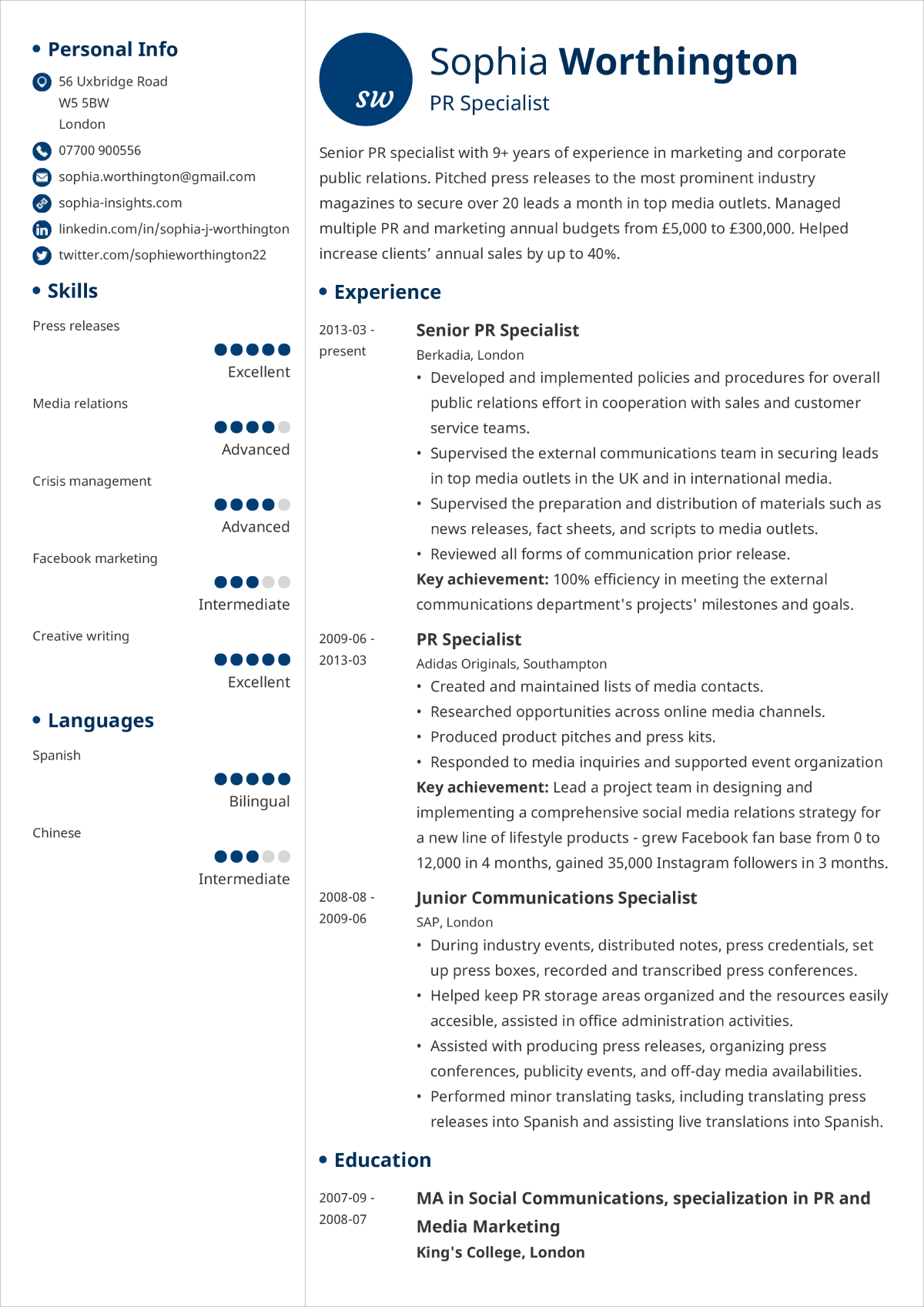
Now you know the crucial principles of laying out and structuring a CV. Below, you will see an example of a proper CV layout.
We've mentioned CV length but how about your cover letter? Read more here: How Long Should a Cover Letter Be [Ideal Cover Letter Length
Making a CV with our builder is incredibly simple. Follow our step-by-step guide, use ready-made content tailored to your job and have a CV ready in minutes.
When you’re done, Zety’s CV builder will score your CV and tell you exactly how to make it better.
7. Proper CV Layout Example
2. The Best CV Layout Examples and Designs
Even when you’re working with the best available advice, getting your CV layout just right can be quite a challenge.
Microsoft Word CV templates and other word processing suites don't always want to play along nicely and you can spend a lot of time on your CV and still have it looking less than ideal.
Thankfully, you have the option of getting some expert help in setting out your CV so that you can focus on just the content.
Our CV builder offers more than 20 different, professional CV templates to choose from. Pick one, fill in your details and you’re done!
Have a look!
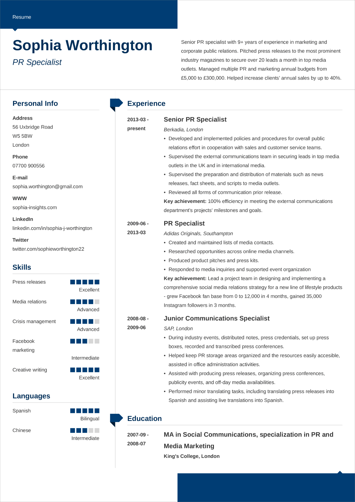
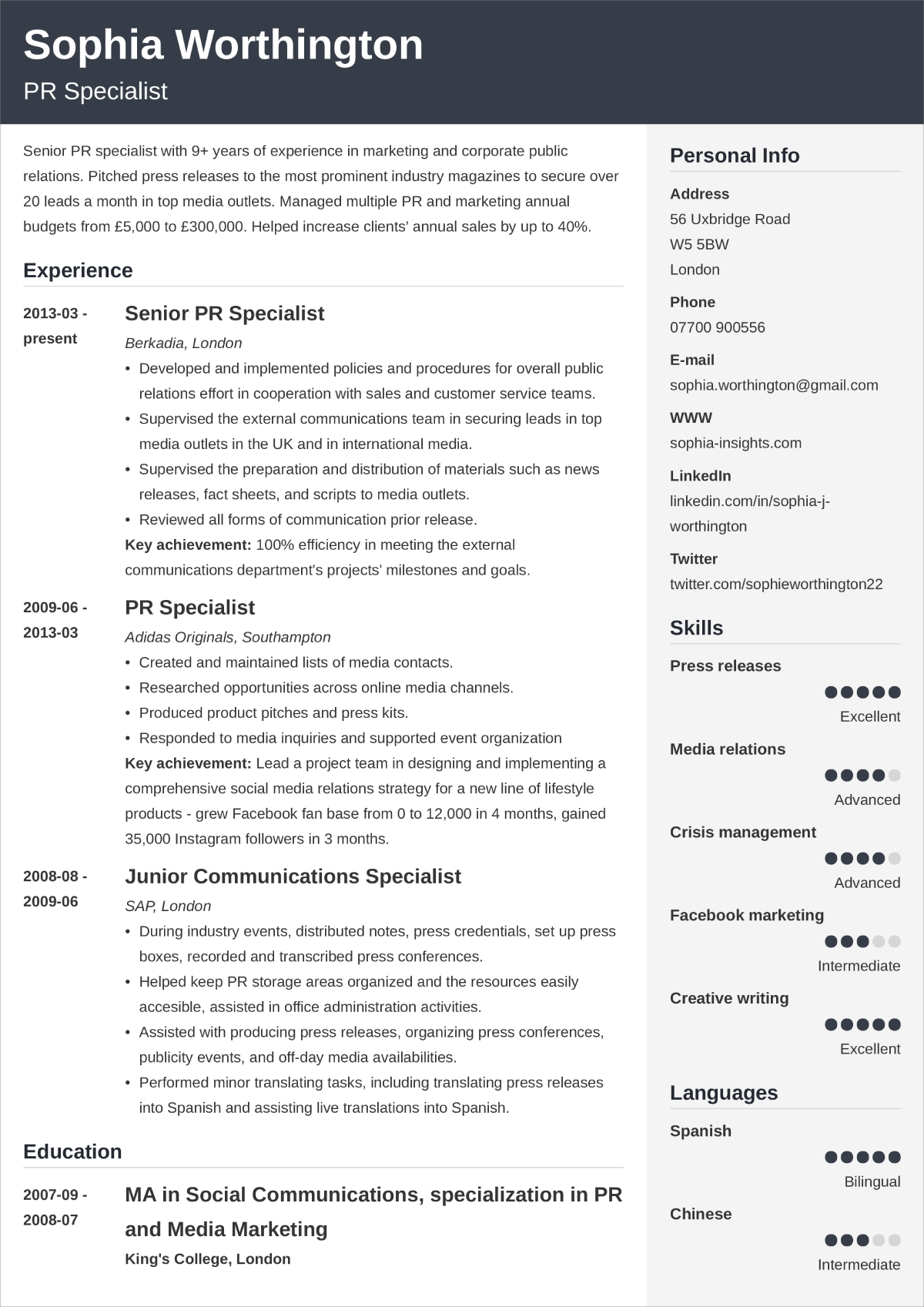
Modern CV Layout
“Modern” is exactly what it claims to be.
A great use of thin lines and icons give a very modern and stylish feel to this CV layout template.
Colored bars set asymmetrically at the top and bottom of the page automatically guide the recruiter’s attention to the middle where all your most important details are.
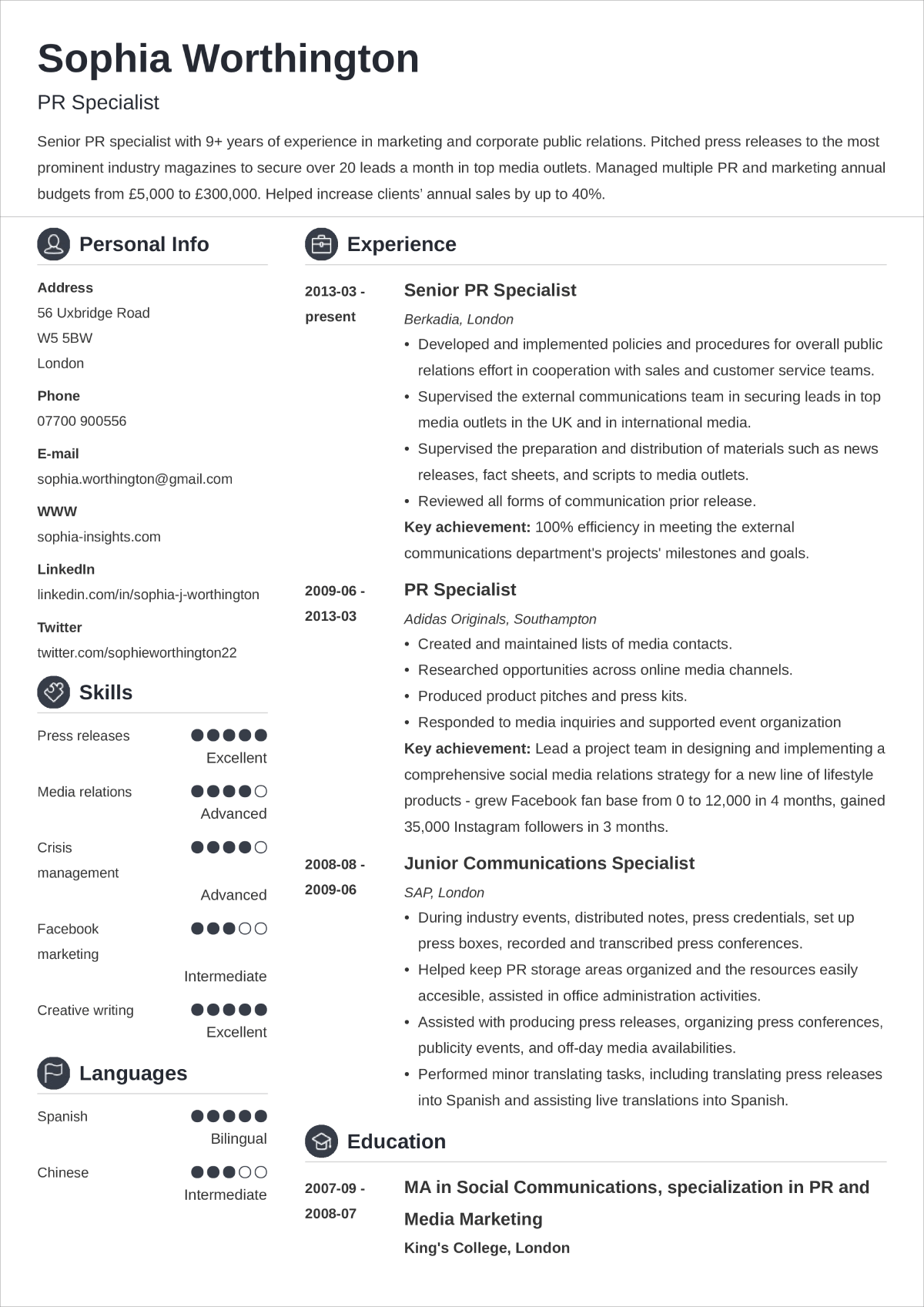
Creative CV Layout
This template is called “Crisp” and crisp is exactly what it is. It makes great use of white space so that the text doesn’t seem overwhelming.
The use of icons draw attention to the section headers which helps employers navigate your CV more efficiently.
Student CV Layout
“Initials” by Zety.
This layout template is sleek and modern with plenty of white space, while the initials at the top will give your CV a hint of personality.
A perfect choice for a variety of jobs and job seekers just starting out their careers.
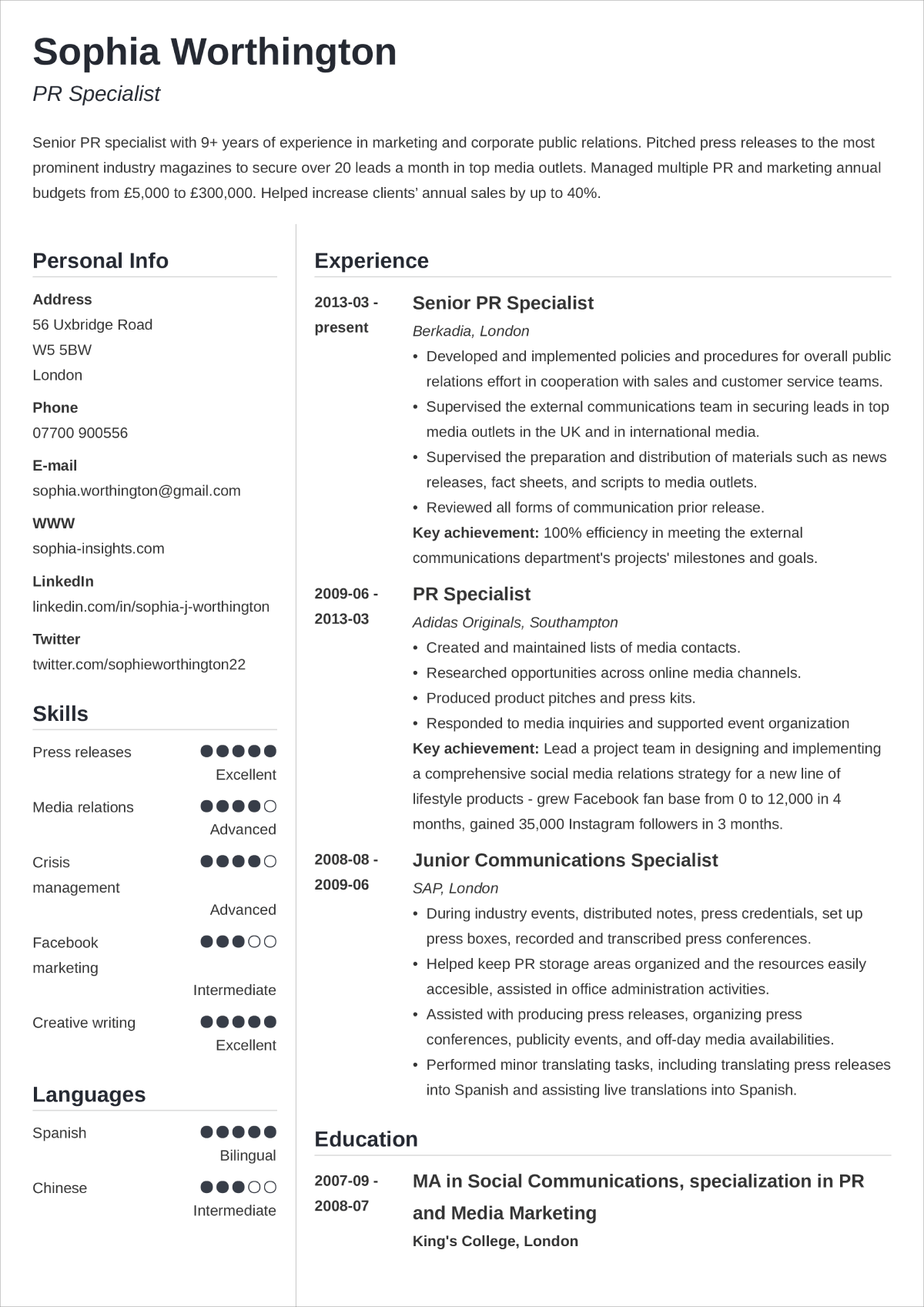
Standard CV Layout
“Cubic” is one of our best-selling templates and that’s for good reason!
Subtle shading draws attention to your personal details and CV header. The nicely formatted CV sections lead the recruiter’s focus to your career experience and skills.
As a whole, this CV layout template has a respectable air and demonstrates you’re a professional.
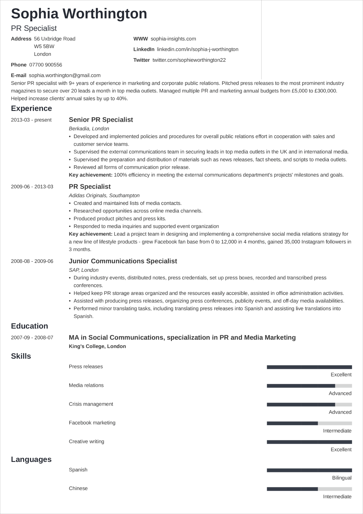
Simple CV Layout
“Minimo” is the perfect choice for those who are in search of a CV layout template that is without any distracting frills.
White space dominates the page with only a couple of coloured bars at the bottom to indicate the level of your skill knowledge.
A great choice for conservative employers.
Professional CV Layout
This CV template may be called “Simple”, but don’t let the name fool you.
It's the best CV template for more seasoned job seekers since the minimalist format allows you to fill up the pages with your career experience and professional skills.
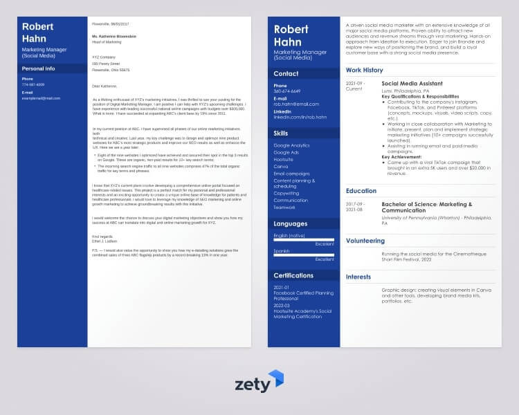
Plus, a great cover letter that matches your resume will give you an advantage over other candidates. You can write it in our cover letter builder here. Here's what it may look like:
See more cover letter templates and start writing.
Key Takeaway
It’s definitely not “one size fits all” when it comes to CV layouts, but if you follow these tips and advice, you can easily find a structure that suits you.
When determining what your CV should look like, keep the following things in mind:
- Use professional fonts, 1.15 line spacing, 1-inch margins and noticeable section headings.
- Arrange your CV sections in the proper order according to your experience and employers’ expectations.
- Keep your CV concise and relevant to the advertised job.
With these strategies in place, you’ll soon find it much easier to apply for any job you want.
About Zety’s Editorial Process
Our editorial team has thoroughly reviewed this article to ensure it follows Zety’s editorial guidelines. Our dedication lies in sharing our expertise and providing you with actionable career advice that offers you real value. Every year, the quality of our content attracts 40 million readers to our site. But that’s not all – we conduct original research to gain a detailed understanding of the labour market. We take pride in being cited by top universities and leading media outlets in the UK and worldwide.

