Table of Contents
You may not realize it, but science has discovered that the font you see actually influences what you think and expect. Obviously, you want your cover letter font to say the important stuff—professional, skilled, and perfect fit.
But how do you choose the best one when there are literally tens of thousands to choose from? Don’t worry, we’ve got this.
In this guide you’ll:
- See a list of the 10 best fonts for your cover letter that will make it look professional and modern.
- Get expert tips on how to format your cover letter fonts to make them easy to read.
- Learn which cover letter font size will have your cover letter stand out.
Want to write your cover letter fast? Use our cover letter builder. Choose from 20+ professional cover letter templates that match your resume. See actionable examples and get expert tips along the way.
Sample cover letter for a resume—See more cover letter samples and create your cover letter here.
One of our users, Valcia, had this to say:
Zety is an excellent resume and cover letter generator with excellent customer service. I love it!
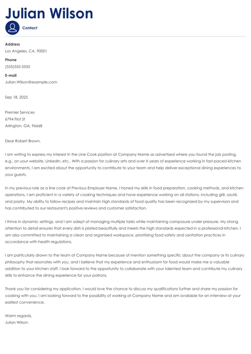
Best Fonts for a Cover Letter
The best font for a cover letter should be simple, clear, and match the font you use in your resume. The most popular choices include Times New Roman, Arial, Calibri, and Verdana. The font size should be set to 12pt and it’s best to limit yourself to just one typeface.
But that’s not the full answer on what font is suitable for a cover letter. If you look close, you’ll notice that all those suggested fonts are on Microsoft Word. So it’s less about actual typefaces and more about availability. As long as your pick is easy to read, you’re good to go.
Here are a few examples:
1. Calibri
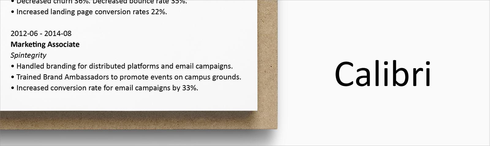
The fact that this font has ousted Times New Roman as Microsoft Word’s default font tells you how popular it actually is. Modern and light, it’s a great choice for your cover letter.
2. Times New Roman
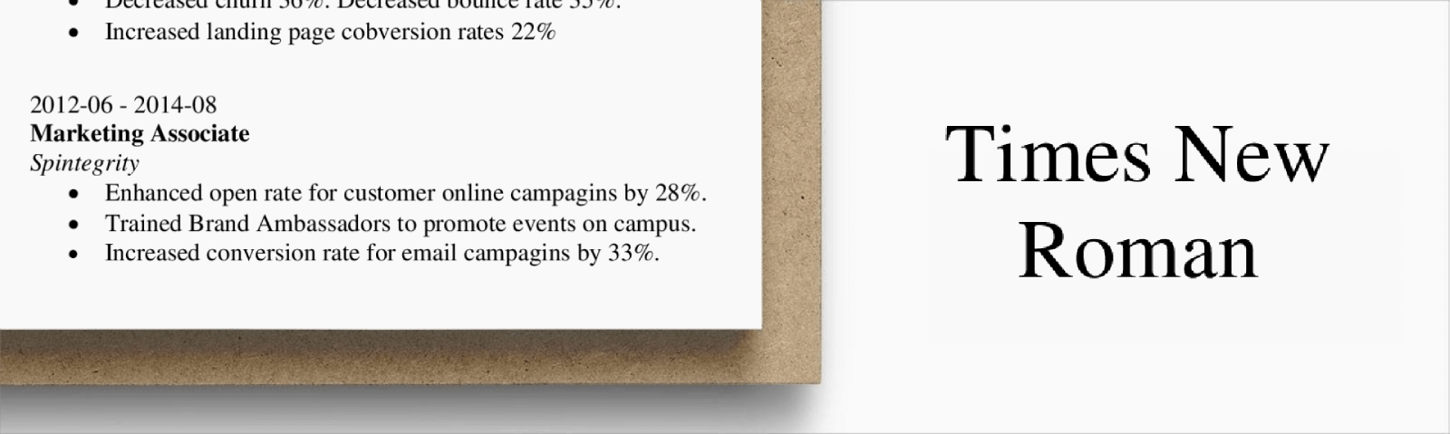
Though no longer the king of all fonts, Times New Roman is still considered the ruler of what are popularly called “traditional” fonts. It’s a good choice for candidates in careers such as law, medicine, government service, or business.
3. Garamond
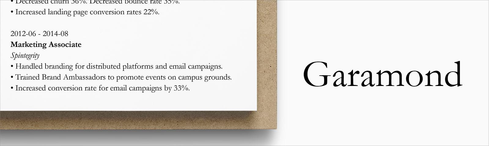
One of the most modern of the serif fonts, Garamond is a nice fusion of the modern look of sans serif and the classicism of serif. Very popular among creatives as well as academics.
4. Arial
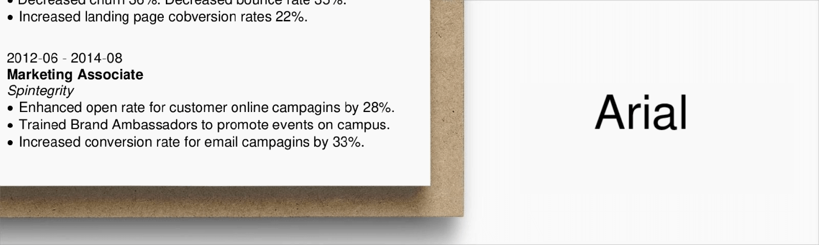
Arial is probably the most minimalist member of the sans serif family. Its sleek, no frills design makes a great font for almost any professional sector cover letter.
5. Helvetica
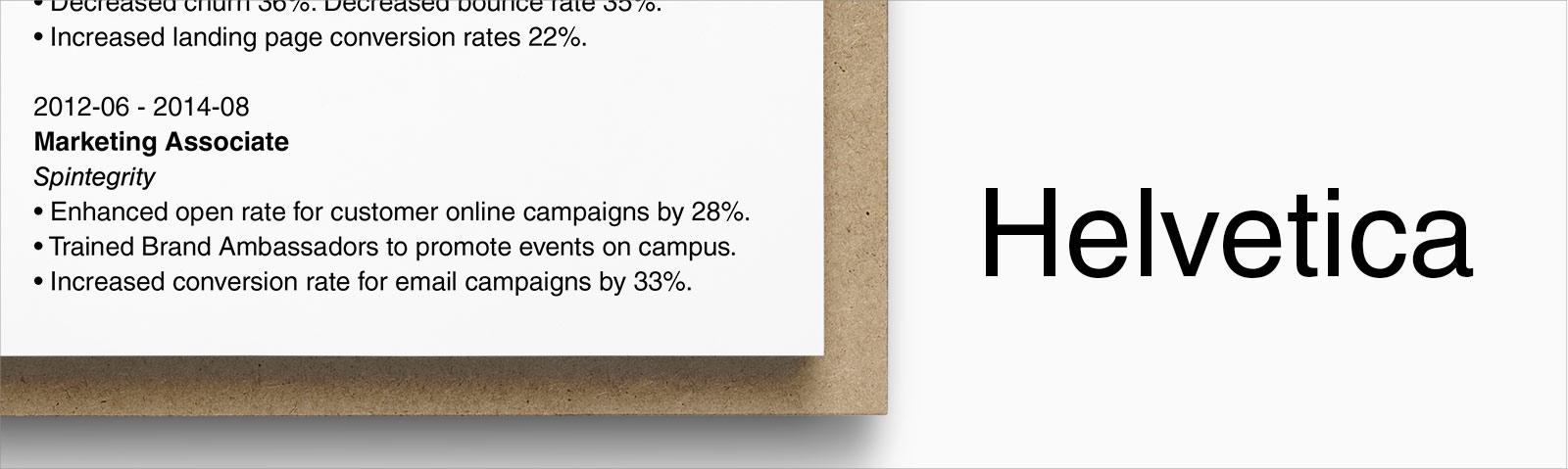
This Swiss font is so popular that it even has its own documentary film! Often used in major brand names, this font is an excellent choice for job seekers in business, marketing, or sales.
6. Cambria

This font was designed to work well for on screen reading and in small sizes so it’s an especially great font to use if you know you’ll be printing your cover letter.
7. Trebuchet MS
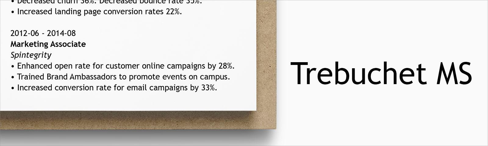
Named after its medieval inspiration, this font is a bit more assertive than others on the list. Slightly larger and darker as well as quite versatile, it’s a good choice for any profession.
8. Georgia
This easy to read font is another fusion of both the modern and classic styles. It’s a very popular font in the writing community and used by big name newspapers. A great font for creative or writing jobs.
9. Tahoma
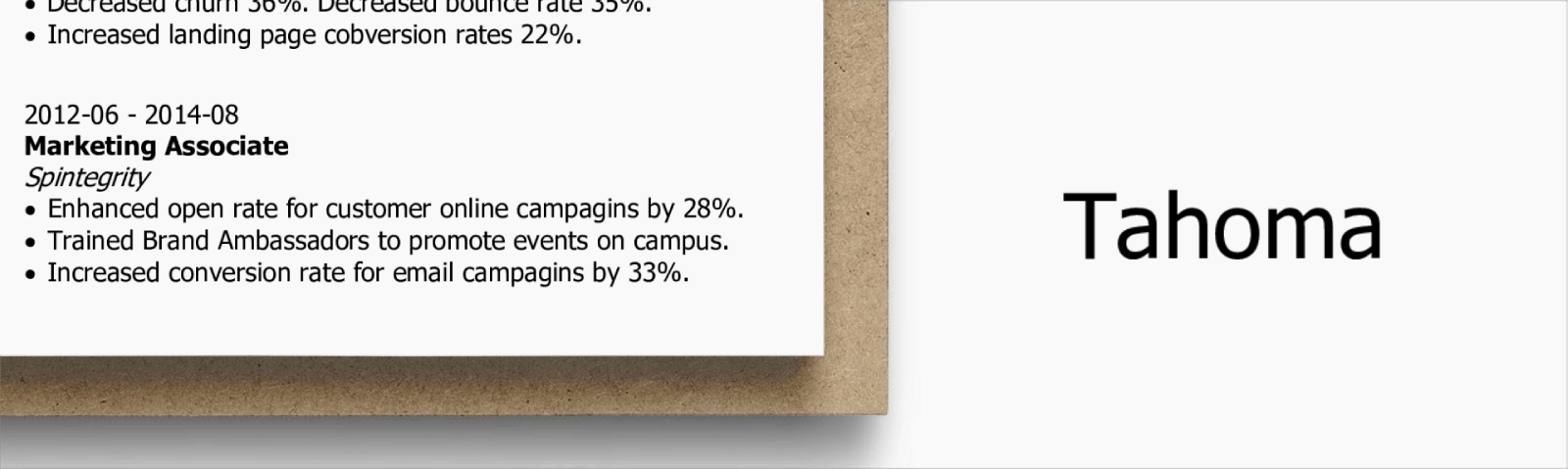
This sans serif font is super easy to read which makes it a great choice for your cover letter no matter what position you’re applying for.
10. Didot
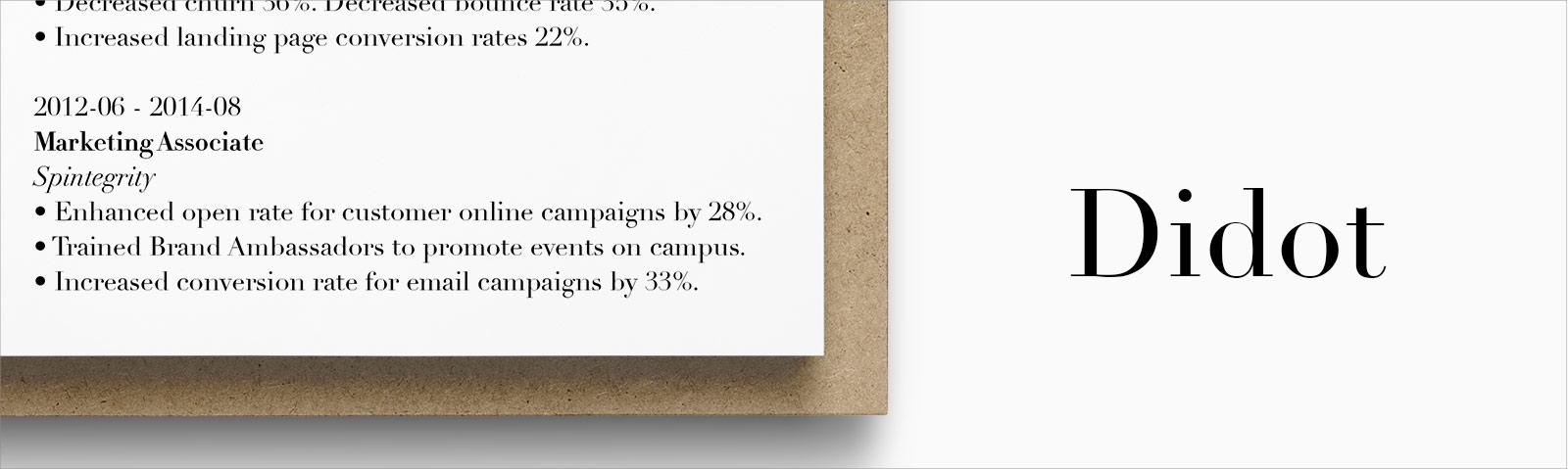
This font is considered one of the more creative in its family. A particularly popular font in the fashion world, this is a great go to for artists and creatives without going overboard.
Sans vs. Sans Serif Fonts
One thing you may have noticed is that some letters have little “tails” at the ends of them while others don’t. Those are serif and sans serif fonts.
Serif fonts have the “tails” and generally have a more classic, distinguished look. Times New Roman or Didot are examples of serif fonts.
Sans serif fonts don’t have the “tails”, giving the letters a sleeker, more modern feel. Good examples are Calibri or Arial.
Neither is better than the other, choose one that suits you.
Here’s a neat hack though— if you see the company you’re applying to using a specific type of font on their webpage or job advert, use a similar font on your cover letter in case they have a soft spot for it.
Cover Letter Font Size
Your cover letter should be written in 12 pt for the most part. Pure and simple. So:
This font size is too big.
This font size is too small.
This font size is just right.
Creating a resume with our builder is incredibly simple. Choose a resume template and follow our step-by-step guidance to have a professional resume ready in minutes.
When you’re done, Zety’s resume builder will score your resume and our ATS resume checker will tell you exactly how to make it better.
Best Font Styles and Formats
Picking the best font for your cover letter is half the battle. The other half comes from formatting it right.
When reading, your eyes go through a natural scan path. Adding all kinds of bells and whistles to your letters only ends up making your cover letter as easy to read as regurgitated alphabet soup.
Before we go through different cover letter formatting options, a gentle word of warning. You don’t need to use all of the below options. And you definitely don’t want to use them all at once.
Cover Letter Font Type
- Bolding
This is probably the most popular and so most overused format option.
Bold is a great format feature, it makes the words really stand out on the page and grab the reader’s attention. The problem begins when it turns out that half the page is in bold and becomes a large mass of black blobs.
Use bold sparingly to really emphasize the most important elements in your cover letter. See what I did there?
- Italicising
This is the second most widely used option to emphasize words. While italics make words stand out as much as bold does, it also makes them slightly harder to read, especially in smaller sizes, so use sparingly.
- Highlighting
Remember that friend back in high school who always highlighted every other line in the textbook because it was “important?” Don’t do that here.
Highlighting, whether printed or on a screen, may draw attention, but also makes it harder to read. It’s also considered rather unprofessional.
Bold or italics are emphasis enough.
- Colouredlettering
There’s absolutely no reason to do this unless your goal is to never get an interview for the rest of your life.
- Underlining
Underlining could be used to emphasise certain words, but for the most part, italics or bold serve that purpose better in cover letters than underlining.
- CAPITALIZING
Caps lock means two things. Someone’s yelling at you or you’re about to get a message “sorry for the caps lock, I wasn’t yelling.”
Refrain from capitalizing in your cover letter. “I INCREASED SALES BY 15%” is, indeed, screaming at the recruiter and there is just no need for that.
If you’re interested in some more tips and tricks on how to format your cover letter properly, check this out: Cover Letter Spacing Made Easy and Cover Letter Layout
We evaluated 11 million resumes created using our builder and found that these are the top 10 professions that often include a cover letter:
- Business Operation Specialists
- Top Executives
- Advertising, Marketing, and PR Managers
- Clerks
- Engineers
- Retail & Sales Representatives
- Healthcare Practitioners
- Financial Specialists
- Teachers and Instructors
- Counselors, social workers, and social service specialists
Key Takeaway
Now you know all you need to get your cover letter all decked out and with somewhere to go.
To make sure you cover letter is charming instead of cheap, keep these things in mind:
- Select a professional font that is easy to read.
- Choose 12 pt font and use formatting options sparingly to really emphasise the key points in your cover letter.
About Zety’s Editorial Process
This article has been reviewed by our editorial team to make sure it follows Zety’s editorial guidelines. We’re committed to sharing our expertise and giving you trustworthy career advice tailored to your needs. High-quality content is what brings over 40 million readers to our site every year. But we don’t stop there. Our team conducts original research to understand the job market better, and we pride ourselves on being quoted by top universities and prime media outlets from around the world.
Sources
Share: