18+ Visual CV Templates: Striking CV Examples for 2026
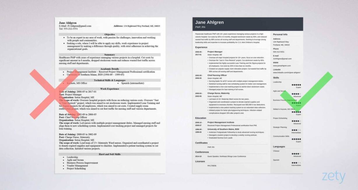
Create your CV nowWhich would you prefer? A plain, boring CV. Dull text on a white background. Or—
A colourful, beautifully laid out CV template with the visual impact to grab recruiters by the shoulders and scream ‘pick me’!
The choice is obvious. We’ve chosen 18 expertly crafted visual CV templates that have stunning good looks plus everything that’s needed to shift your job search into top gear.
Let’s make a start.
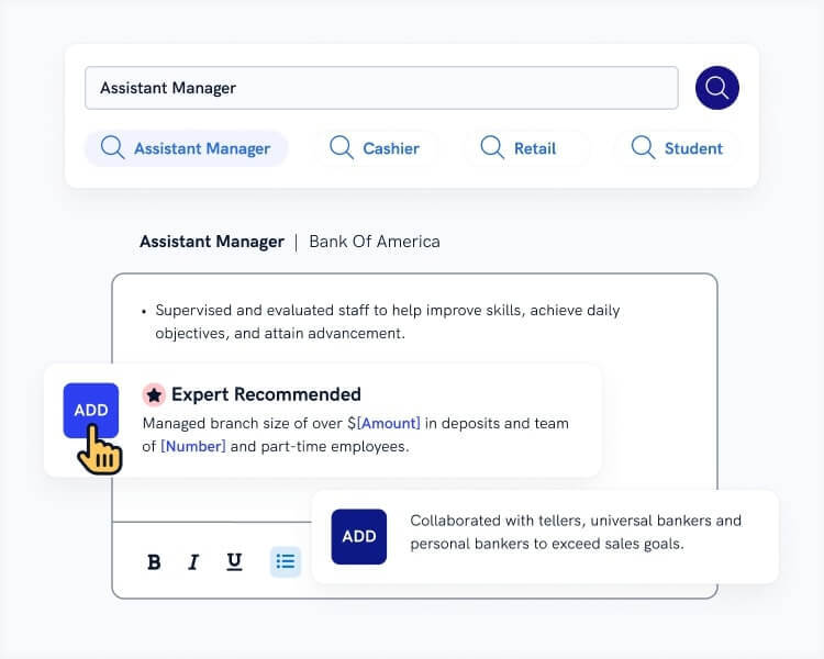
Want to save time and have your CV ready in 5 minutes? Try our CV builder. It’s fast and easy to use. Plus, you’ll get ready-made content to add with one click. See 20+ CV templates and create your CV here.
Sample CV made with our builder—See more CV examples here.
Visual CV examples not what you’re looking for? Take a look at our other guides:
- Top 10 Best CV Templates to Dwnload
- What to Include in a CV: Essential Sections for Success
- Why You Should Never Use a Free CV Maker
- 18 Creative CV Templates
- 10+ Canva CV Templates (+ Alternatives to Canva CV Maker)
- Retail CV Example and Template
- Waiter / Waitress CV Example and Template
- Receptionist CV Example and Template
- Customer Service CV Example and Template
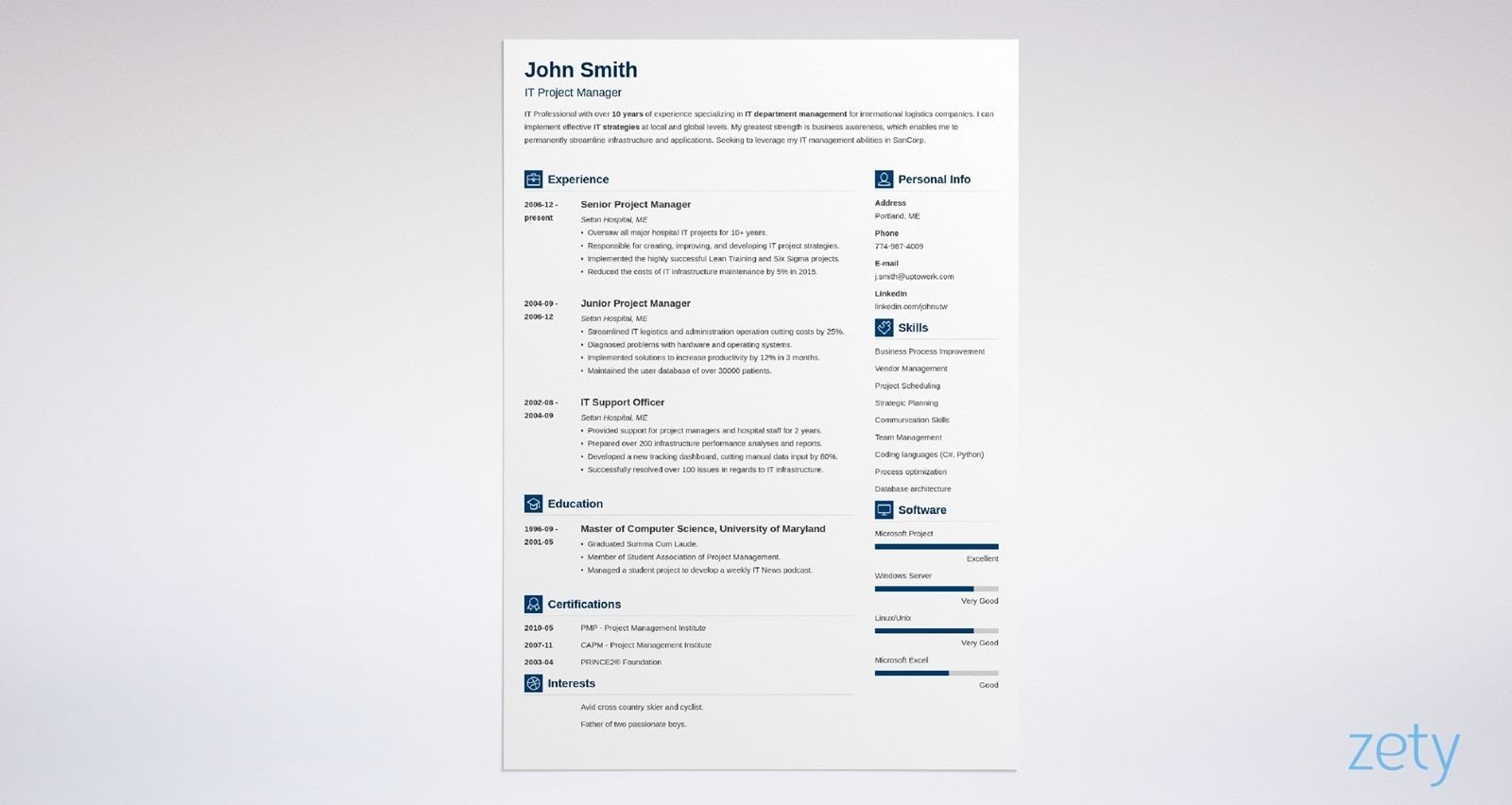
1. Cascade
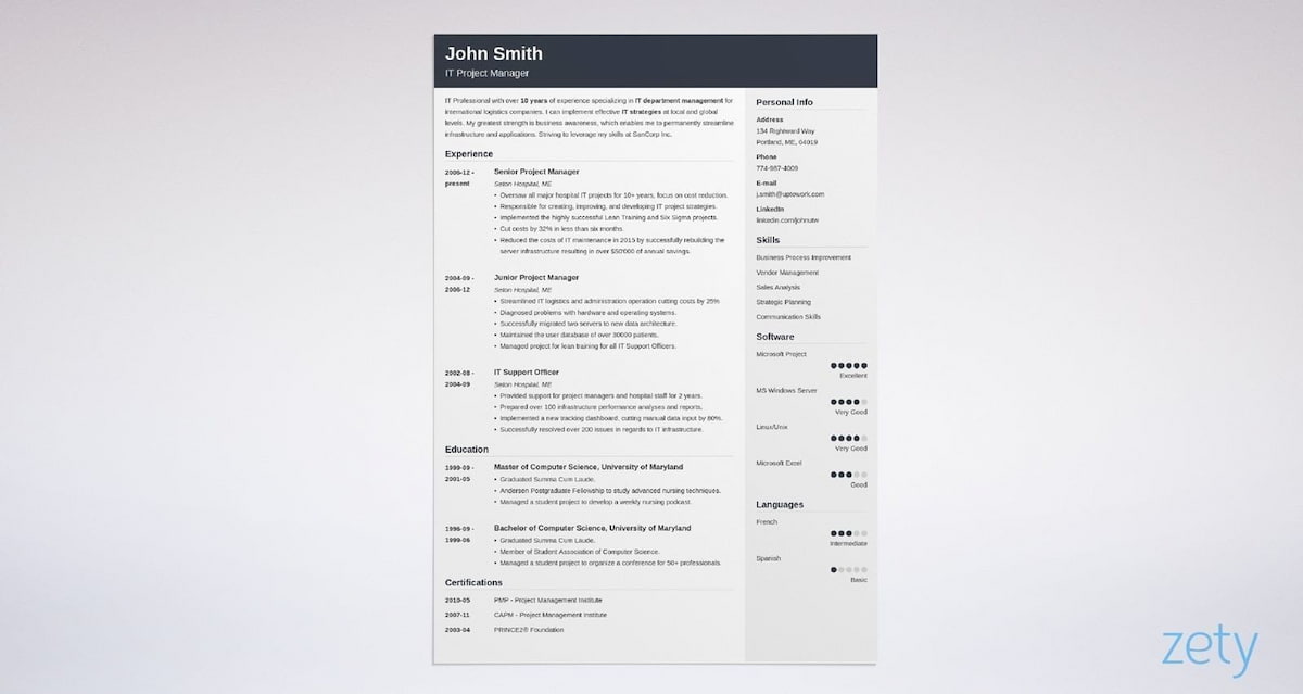
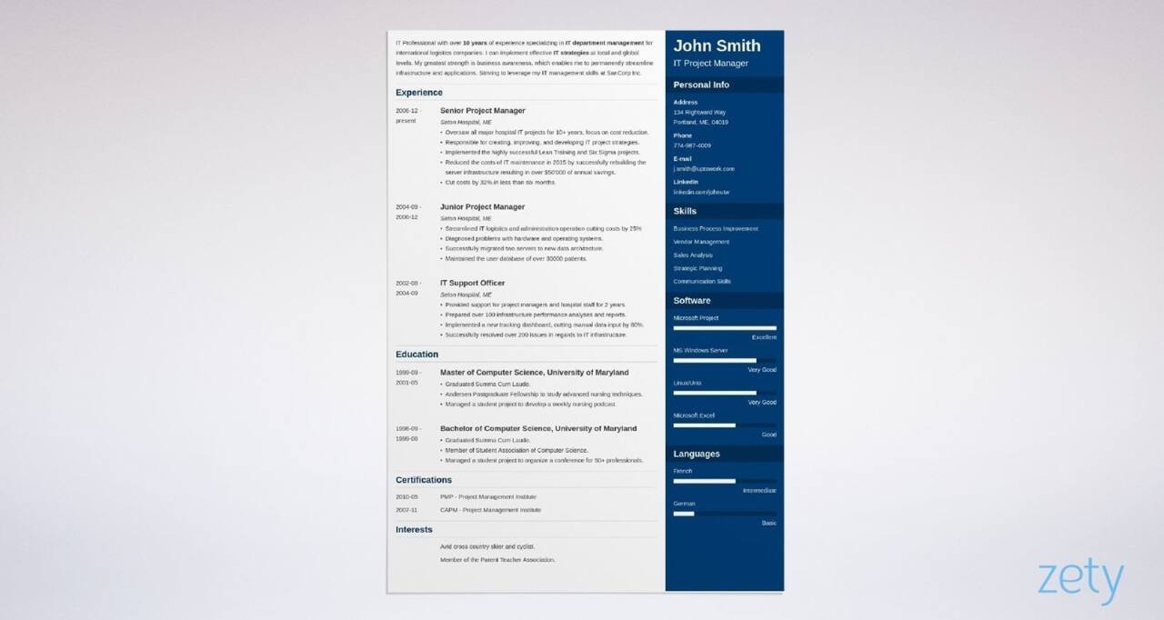
The first visual CV we have for you is Cascade. You’ll be sure of a professional first impression when you choose this CV template. There are visually pleasing colour shades, a two-column design and plenty of white space, that all-important visual element that helps make reading easy.
Like all of our CV templates it doesn’t just look good, it’s smart too. Every Zety CV template is fully scannable by ATS software.
Don’t forget, visual impact makes the first impression but all the good design in the world won’t hide a badly written CV. Here’s how to make your content as impressive as your visuals: How to Write a CV: Professional UK Examples
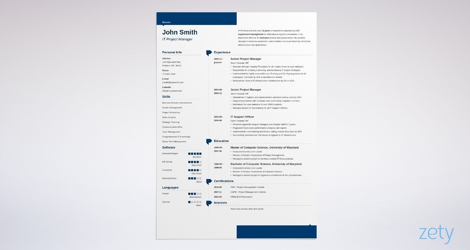
2. Concept
Since we’re on the topic of visual CV templates, just how powerful do you think human vision is? Let me tell you, the numbers are incredible. Our retinas have a million cells in each eye and together they transmit data at around the same speed as an Ethernet connection.
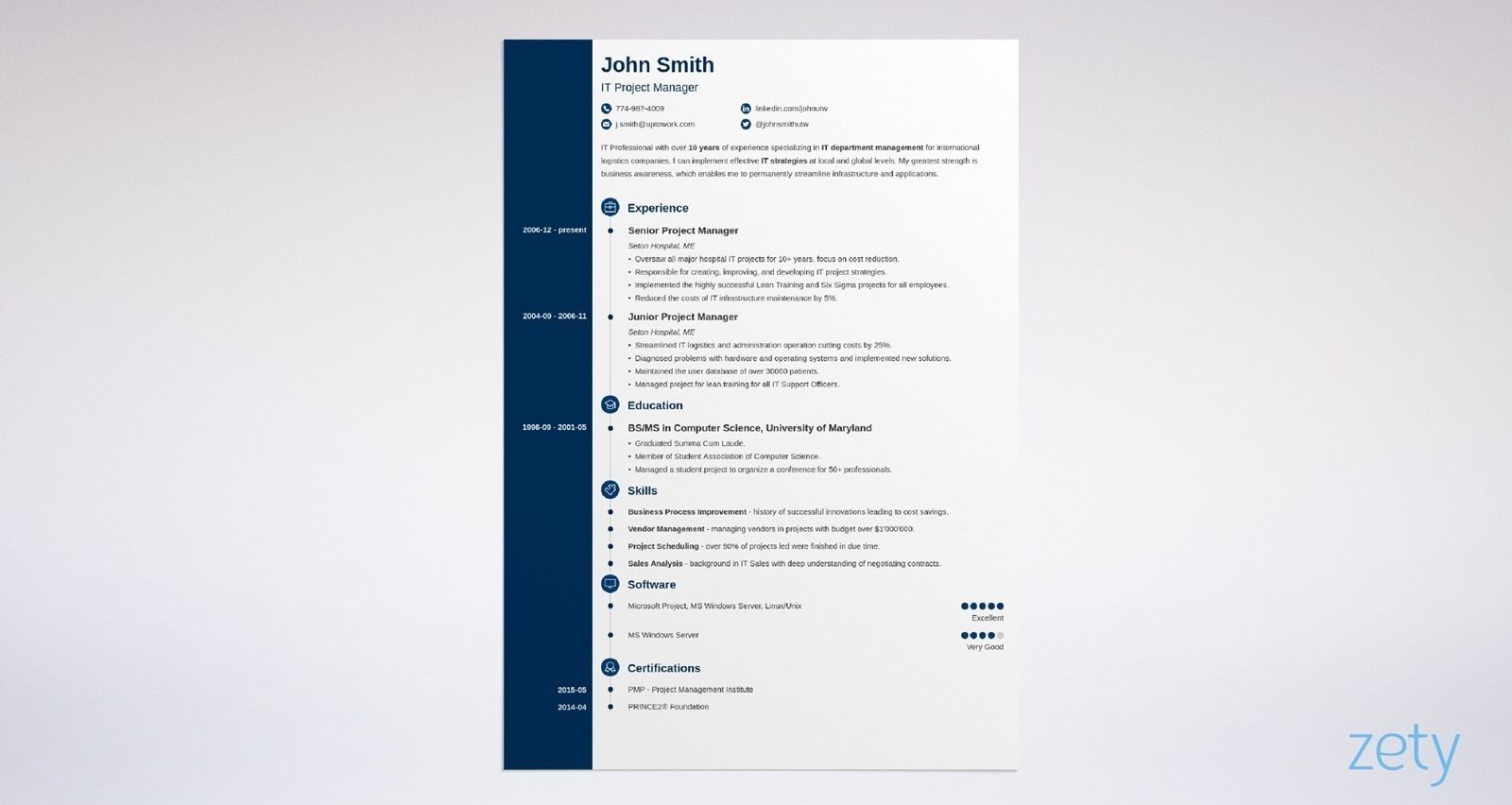
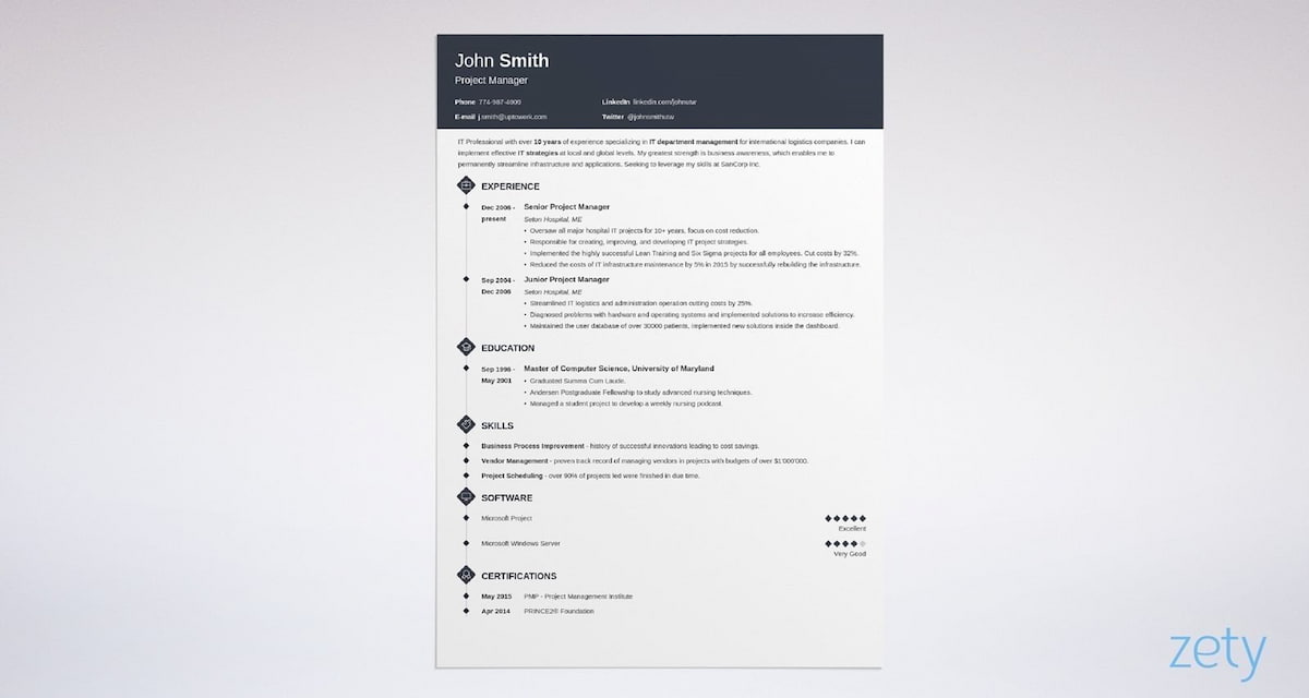
That’s an incredible amount of information. Our Concept template will make sure the hiring manager ‘downloads’ everything they need in a perfectly presented package. The clever visual trick here is the timeline. It drags the eye down the page, ensuring all of your CV gets taken in.
Like all of our templates, Concept is versatile. You can rearrange sections, change fonts and change the date format with ease in our visual CV builder. All while keeping your CV layout intact.
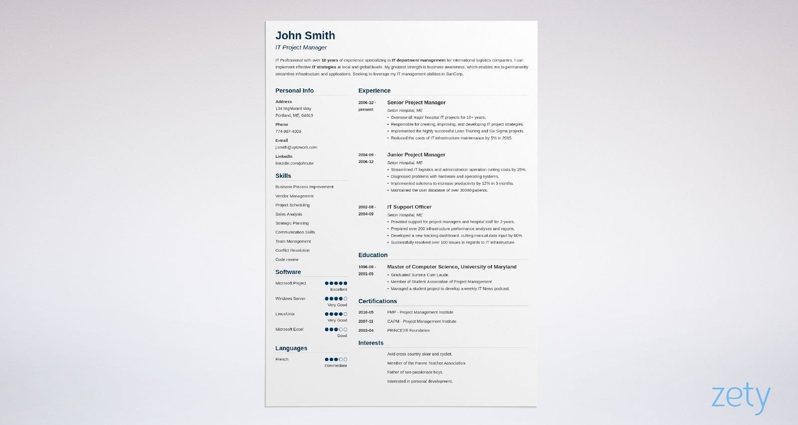
3. Crisp
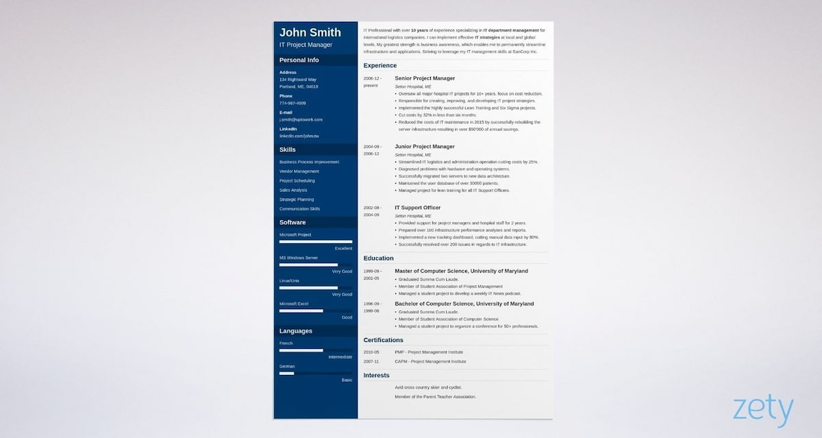
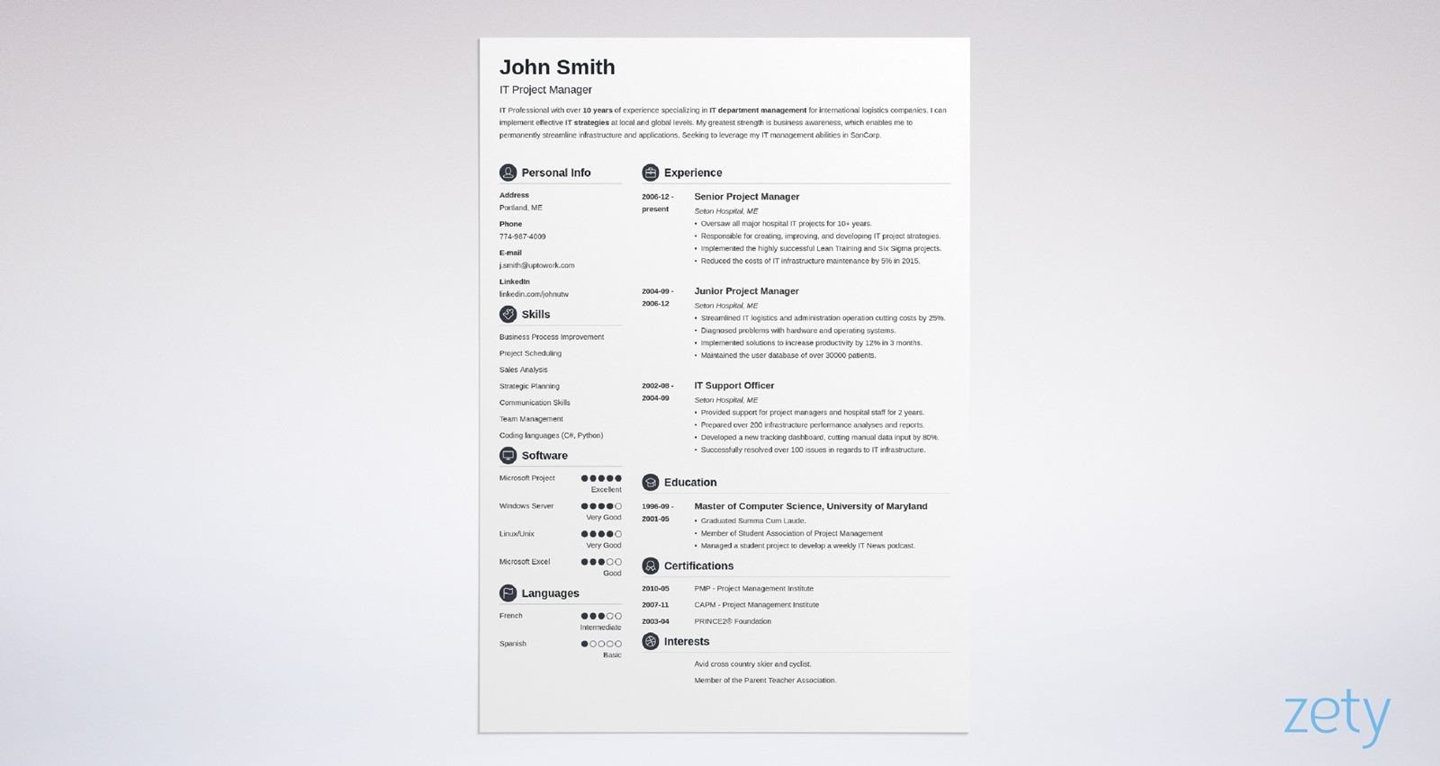
Crisp. The name itself conjures up visions of sharp, well-defined visual elements and this visual CV template definitely delivers on its promise. Clean monochrome design, bold circular CV icons and plenty of room for important sections such as your CV personal statement. An excellent choice for printing out on paper.
The human eye can see up to 10 million colours. Our CV maker doesn’t give you quite that many choices, but you can still choose from 400 shades. More than enough to give your CV a distinctive look.
4. Cubic
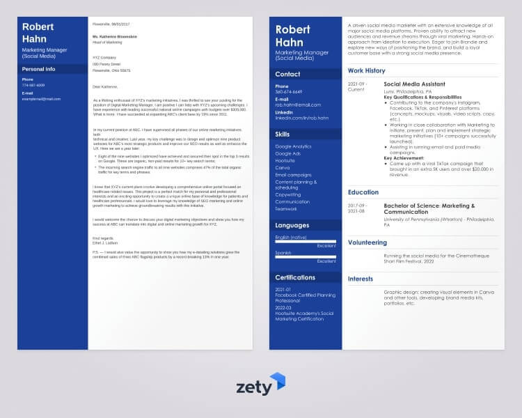
Our Cubic visual CV template makes it hip to be square. Your content is neatly divided into three sections. Dark header bar, grey sidebar and spacious main column. Like many of our templates it makes use of health bars to demonstrate the level of your skills. A visual element borrowed from gaming, but perfect for recruitment too.
Every Zety CV template has a matching cover letter template for an even more striking visual effect. Learn how to write your cover letter here: How to Write a Cover Letter: Complete Guide
5. Diamond
Diamonds are? a) Forever b) A girl’s best friend c) In the sky with Lucy or d) Rihanna’s chart-topping 2012 hit. That’s a trick question, the answer is all of the above. They also happen to inspire our Diamond template. One of our most self-explanatory visual CV examples. The CV icons, the bullet points and the health bars, all diamond-shaped.
And whichever template you choose our CV builder will give you expert advice as you write. It’s like having me stand behind you and whisper sweet career expert nothings in your ear. But less creepy.
6. Enfold
You probably think this template looks familiar, and you’d be right. It’s the mirror image twin of our Cascade template. All the same visual CV elements, everything still in the right place, it’s just a matter of personal preference whether you want the sidebar to the right or the left.
It may seem trivial, but we actually put a lot of work into choosing our fonts. And you should too, they’re essential to creating a visually pleasing CV template. Read more here: Most Professional Fonts for a CV
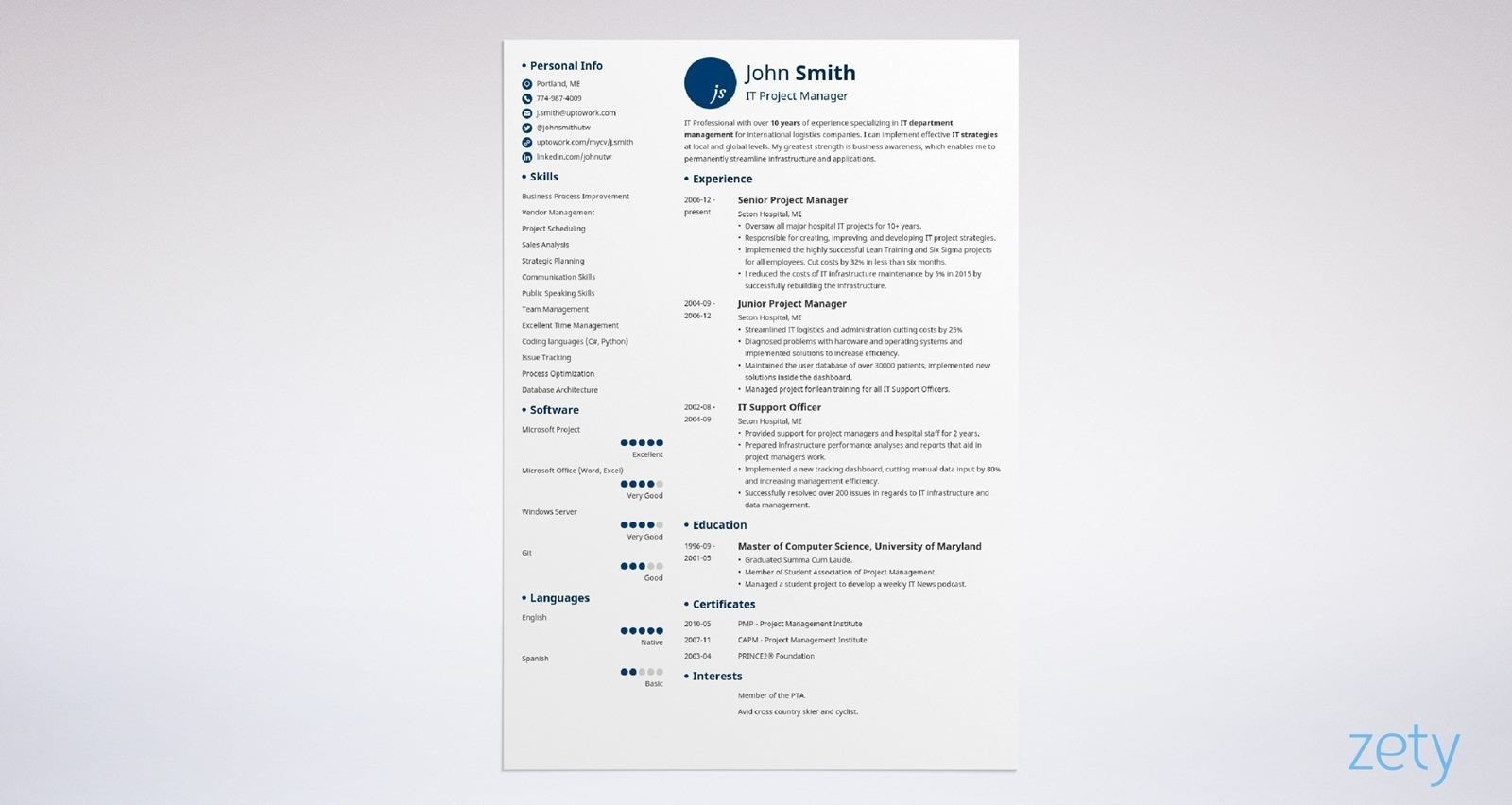
7. Iconic
This template does exactly what it says on the tin. It makes good use of icons to create a clear, self-explanatory visual experience. Each icon visually indicates the section it accompanies for added emphasis.
The skills section has a great icon don’t you think? But make sure you’ve got great content to match. Read more: Key Skills to Put on a CV: Best List of Examples
8. Influx
This template’s name sounds like a hot tech startup and looks like a million dollars of venture capital to get it off the ground. The header bar makes a bold visual statement. Dark and striking, with your name highlighted in bright white text. Then lots of room for content in the generous one-column design.
This template would be a great choice for a skill-based CV. But would this specialised format suit you? Find out here: Skills Based CV Template: Writing Guide & Examples
9. Initials
Here’s another aptly named visual CV. It puts your initials in a large circular icon in the CV header. It’s like a stamp of approval for your CV. Initials also makes good use of coloured fonts to highlight the title of each section.
This template works great for a one-page CV, or even a two-page CV. But should you do more? How long is too long? Find out here: How Long Should a CV Be? Best Page Length
10. Minimo
If you love minimalism, go for Minimo. Well-designed visual CV examples don’t need excessive ornamentation. This template is striking in the simplicity of its presentation. An excellent choice for job hunters targetting more conservative roles.
Making a CV with our builder is incredibly simple. Follow our step-by-step guide, use ready-made content tailored to your job and have a CV ready in minutes.
When you’re done, Zety’s CV builder will score your CV and tell you exactly how to make it better.
11. Modern
No matter how many times I see our Modern CV template I’m still struck by the visual impression it makes. I’m sure that you will be, too. Using an alternating top and bottom bar as a colour accent pulls your gaze across the page. The hiring manager who reads this has no choice but to scan everything you’ve written. Incredibly effective.
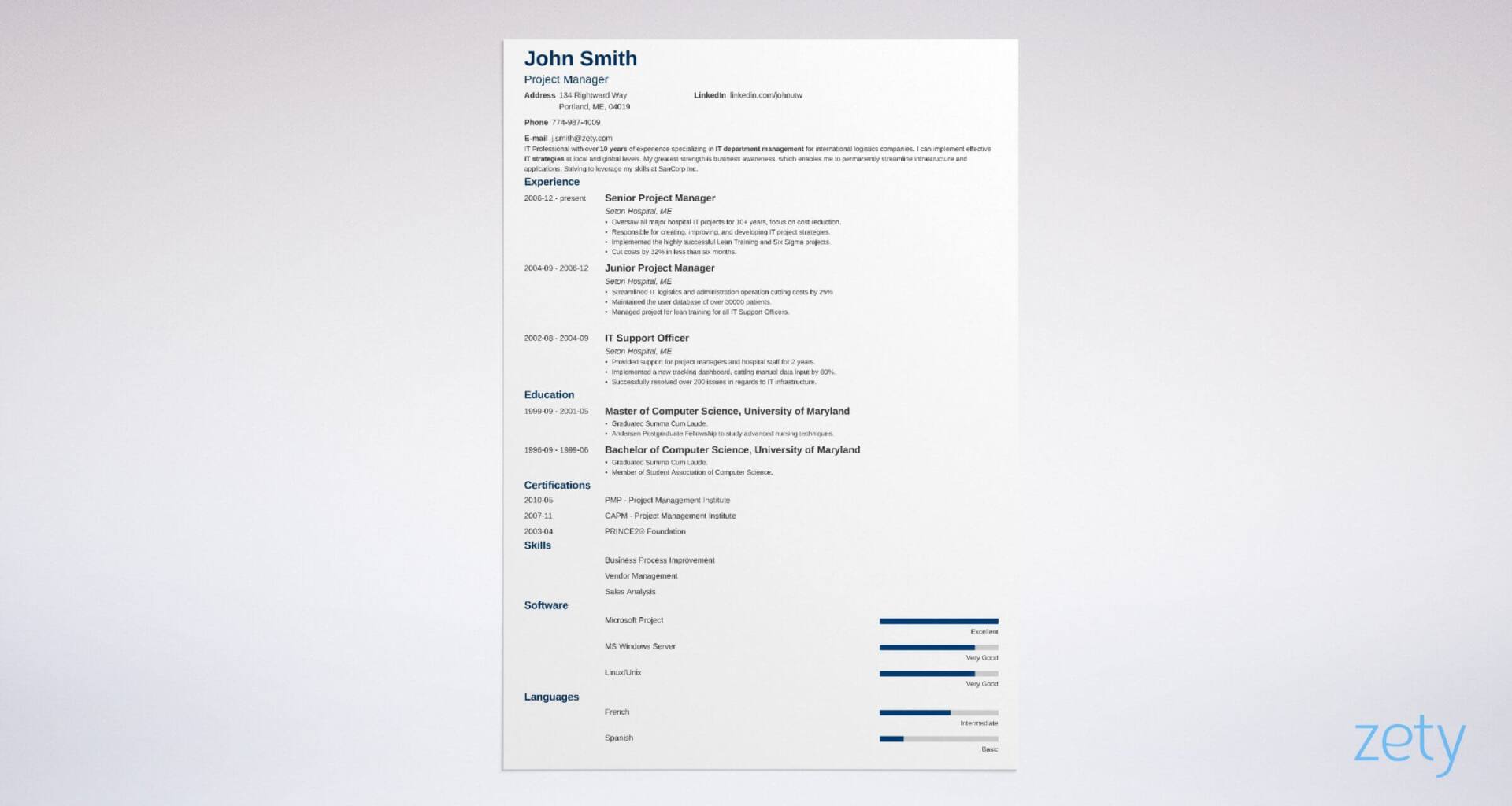
12. Muse
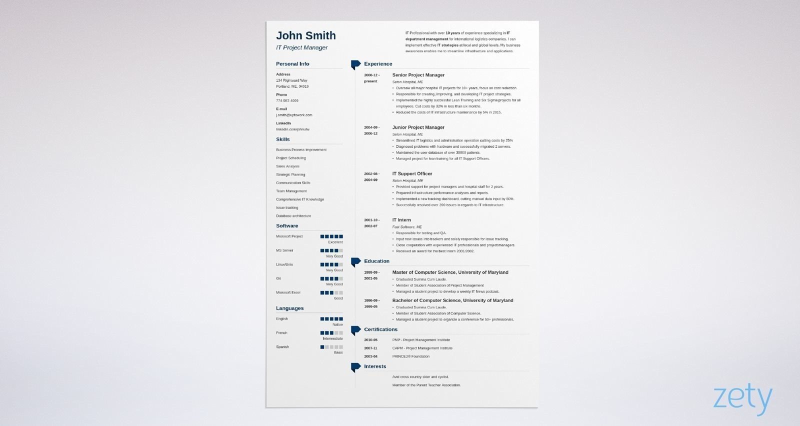
You’ll be able to make good use of Muse if it’s your choice of visual CV template. Its information rich two-column design is accented by ribbon-shaped icons for each section heading. After all, who doesn’t want a blue-ribbon quality CV?
13. Nanica
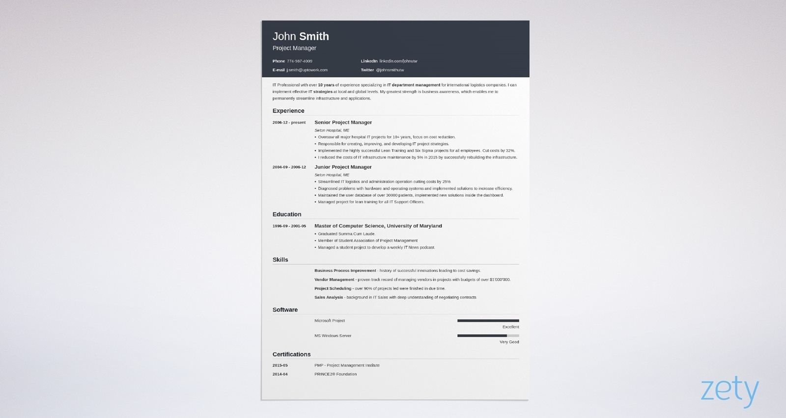
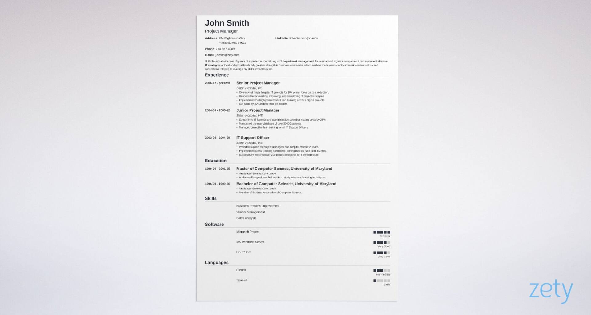
Nanica has taken the minimalist approach and pared it back even further. It’s bare bones, but perfectly designed. Section headings and dates are placed to the left, section content to the right and fine lines neatly box everything off. There’s a subtle health bar to add some visual interest too.
Looking for more CV writing titbits? Find them here: 20+ Job-Winning CV Tips & Advice
14. Newcast
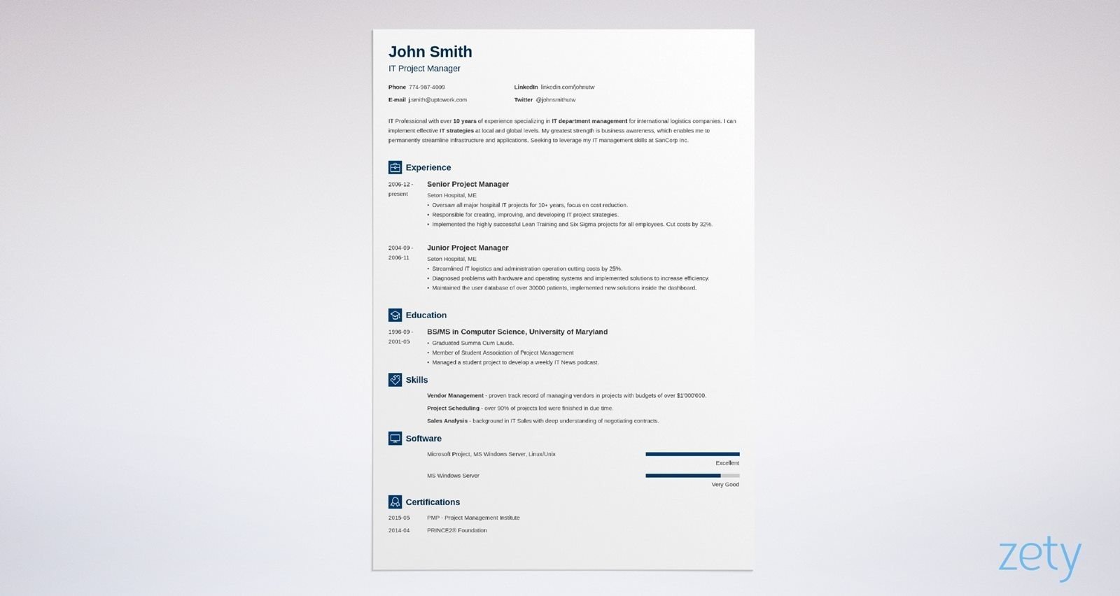
Back to a more visually rich template now. Newcast spices up the classic one-column format with CV icons, coloured section titles and a good contrast between bold and standard weight fonts to highlight important information. A solid choice, regardless of which CV format you choose.
15. Primo
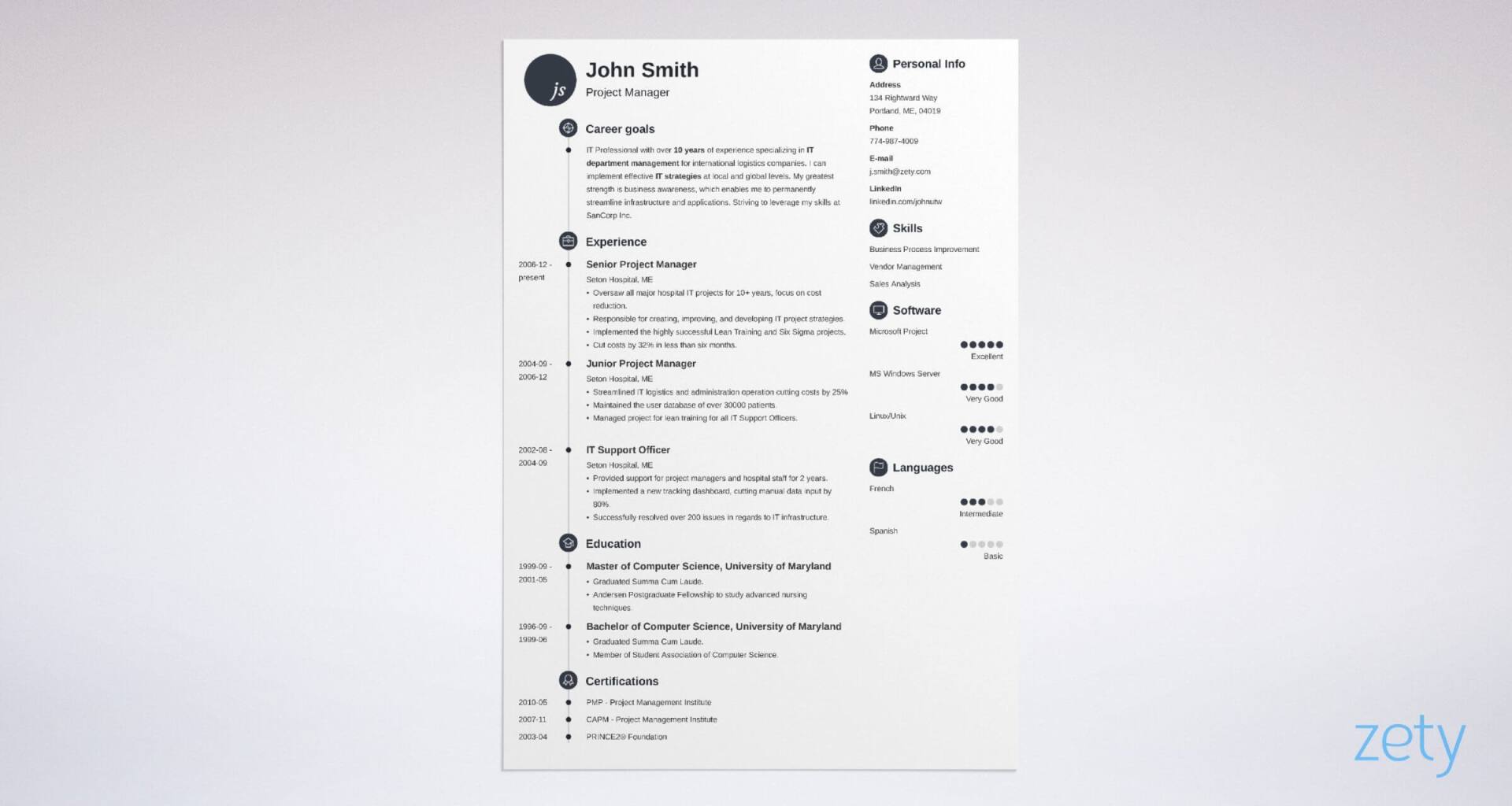
Writing a CV is like creating a promotion for your skills and experience. So for your personal promo, why not go Primo? The icons, bullet points and other graphical touches follow a circular theme. There’s a badge for your initials and a timeline to boot. A first-class visual CV.
16. Simple
What more can I say, it’s Simple. Cutting back on the graphical elements leaves plenty of room for content. A perfect choice of CV template for more experienced candidates.
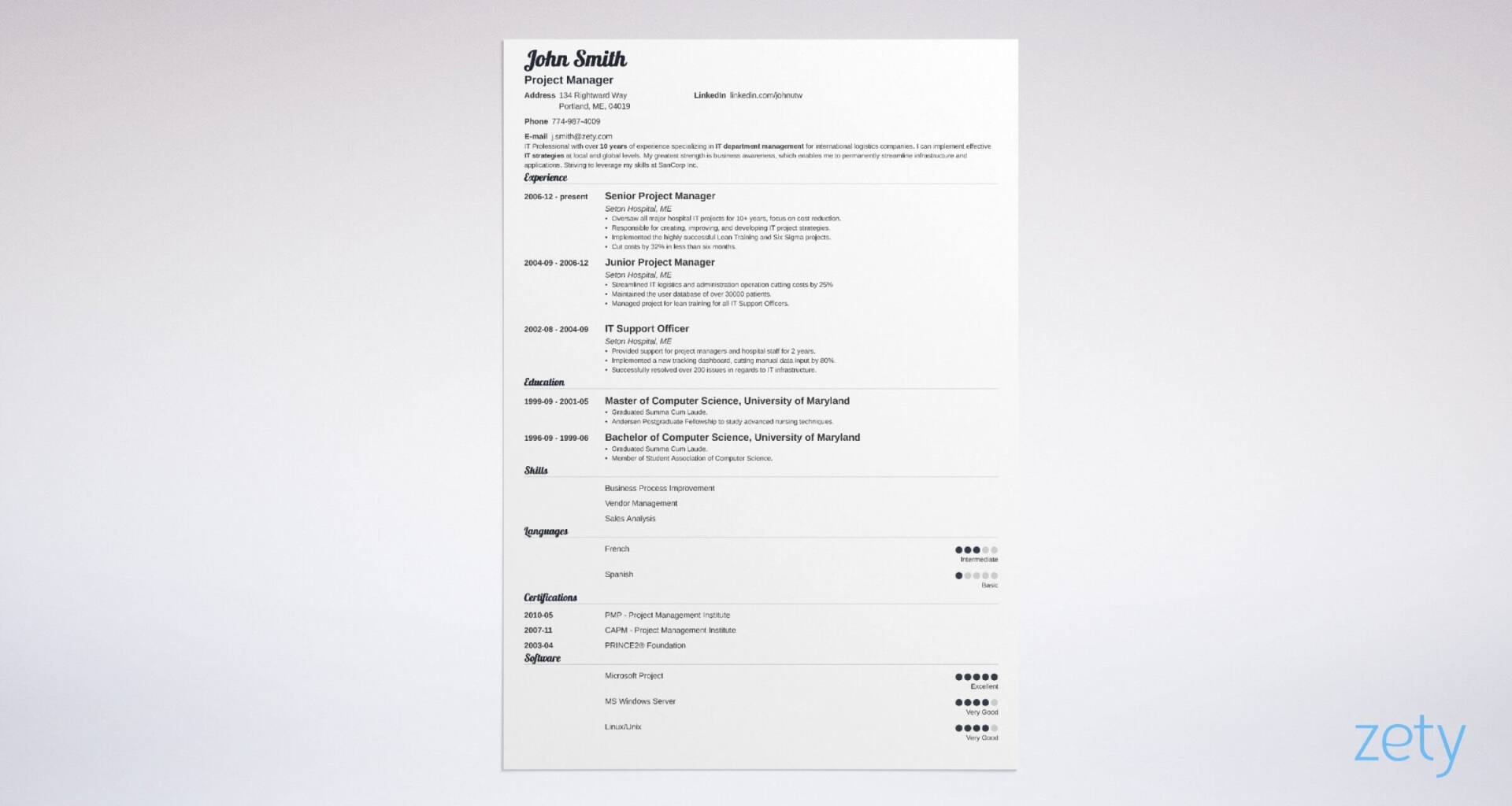
17. Valera
If I had to choose which is our best CV template, it’d be this one for sure. Valera is deceptively simple, but the cursive script for your name and section headings give it a fresh and unique visual twist. Its youthful feel would be the perfect match for a student CV or graduate CV.
18. Vibes
And to finish off our round-up of visual CV templates I present you with Vibes. And a strong finish it is! All the visual elements that you’d expect are featured in this template. An eye-catching header, two-column design, icons, health bar and timeline. Every visual enhancement you need to create a job-winning CV.
And that’s it, you’re all set to choose the best visual CV for your needs.
Plus, a great cover letter that matches your CV will give you an advantage over other candidates. You can write it in our cover letter builder here. Here's what it may look like:
See more cover letter templates and start writing.
Thanks for reading.
About Zety’s Editorial Process
Our editorial team has thoroughly reviewed this article to ensure it follows Zety’s editorial guidelines. Our dedication lies in sharing our expertise and providing you with actionable career advice that offers you real value. Every year, the quality of our content attracts 40 million readers to our site. But that’s not all – we conduct original research to gain a detailed understanding of the labour market. We take pride in being cited by top universities and leading media outlets in the UK and worldwide.

