What Should a Good CV Look Like in 2026?
Create your CV nowLooks aren’t everything, or so the saying goes. That’s definitely true when it comes to people but not for a CV.
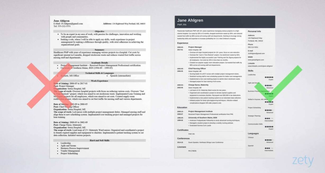
In fact, what should a CV look like should be the question that’s first and foremost in your mind. Recruiters look at hundreds of CV’s a day and their practised eye will instantly spot anything that looks off. End result, rejection.
But you’re about to learn everything you need to know about what should a CV look like. Read on and you’ll learn all about how to perfect layout, format and how to write a CV that hiring managers will love.
Let’s get started.
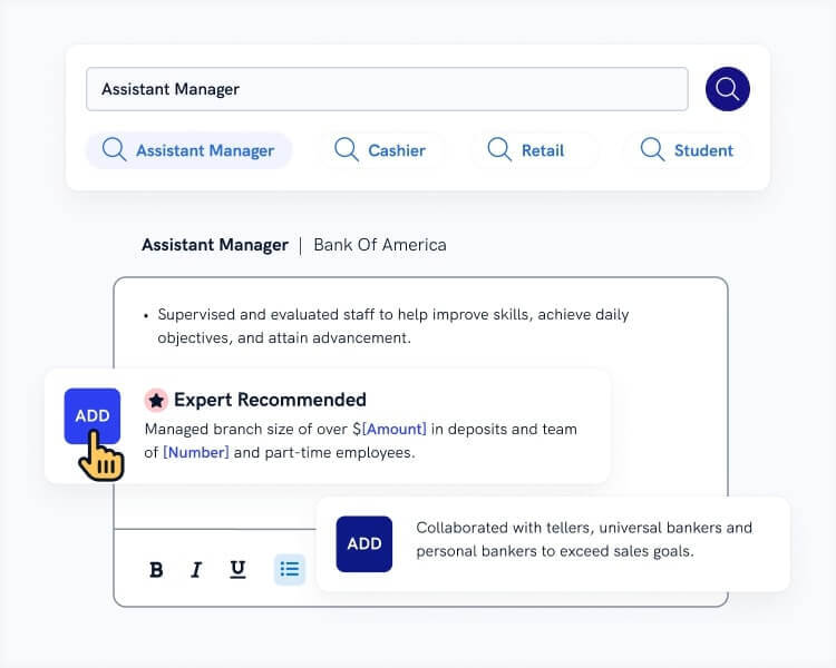
Want to save time and have your CV ready in 5 minutes? Try our CV builder. It’s fast and easy to use. Plus, you’ll get ready-made content to add with one click. See 20+ CV templates and create your CV here.
Sample CV made with our builder—See more CV samples here.
Want to know what a CV looks like for your job? Read more:
- What should a teacher's CV look like? Teacher CV Example & Guide
- What should a graduate CV look like? Graduate CV Example & Guide
- What should an academic CV look like? Academic CV Example & Guide
- What should a TA CV look like? Teaching Assistant CV Example & Guide
- What should a support worker CV look like? Support Worker CV Example & Guide
- What should a graphic design CV look like? Graphic Designer CV Example & Guide
Expert Curated Video Content
If you prefer watching, our Certified Professional CV Writer, Caio, will explain what your CV should look like!
1. What Should a CV Look Like
Before we get into the nitty-gritty of how to write a CV lets get our basic set up sorted. A CV is a formal business document. It needs to follow the basic rules of good design and CV layout to satisfy recruiters and enable them to easily find all the information they need. So here’s how to give your CV’s looks a much-needed makeover.
CV Layout
Getting your CV layout right is easy, and once you’re done you’ll give a professional first impression that gives you an instant advantage over the competition. Here’s what to do to create the best CV template.
Font size and page margins: create plenty of white space for a look that’s well-structured and easy on the eye. Set your margins to one inch on each side. Set your font size to 11–12 pt. Use 1.15 line spacing and double space between each CV section.
Font type: use a clear and readable CV font. Your choice of font can make a huge difference to the overall look of your CV. Try Helvetica, Cambria or Gill Sans (formerly a favourite of the BBC). Set your font size 4–6 points larger for your section titles and for your name in the CV header.
Font formatting: if you’re feeling creative try font pairing, mixing different fonts for visual effect. Take a look at our CV templates and check out Valera to see how good it can look. Use bold and italics to emphasise important information, but be consistent and avoid underlining as it looks messy.
File type: unless the job advert specifies otherwise, save your CV as a PDF to make sure your layout stays intact.
Read more: CV Layout: How to Lay Out a Professional CV
CV Length
How long your CV should be is one of the most hotly debated topics in recruiting. But in short, you should keep it short! 1–2 pages is the limit, unless you’re writing an academic CV. So what’s best for you? One page or two?
To be honest, there’s no hard and fast rule and don’t let anyone tell you otherwise. But here are some guidelines to help you decide.
- One page CVs are great for school leavers, students, fresh graduates and candidates applying for entry-level roles. They’re also appropriate for candidates with less than 5 years of experience.
- Two page CVs are perfect if you have 5+ years of professional experience, especially in management and specialised technical roles.
Read more: How Long Should a CV Be? Best Page Length
What to Leave Out
Some things should never appear on a CV. They’ll instantly make your CV appear unprofessional. So when you consider what should a CV look like, here’s what to leave out.
Your home address: nobody sends interview requests by post anymore, so you’re just wasting valuable page space that can be used for job-winning content.
An unprofessional email address: I’m looking at you bigboy69@gmail.com. Go for one based on a combination of your name and surname.
A photo: never include a headshot with a UK CV template. It’s common on the continent but a red flag for many British recruiters. Save your own good looks for the interview.
Personal information: for example, marital status and date of birth. Another waste of space and it leaves you open to discrimination.
Irrelevant information: For example, never include a CV hobbies and interests section just for the sake of it. Your love of navel lint collecting isn’t going to win you interviews. Keep your CV tailored and stick to information that’s relevant to the job.
Remember: Spelling and grammatical errors on a CV are a particularly bad look. They’re often cited as the number one worst mistake you can make. Double-check your CV, have a friend check and use a reliable spell check app such as Grammarly to make sure everything is perfect.
Read more: References on a CV: Should You Include Them?
Making a CV with our builder is incredibly simple. Follow our step-by-step guide, use ready-made content tailored to your job and have a CV ready in minutes.
When you’re done, Zety’s CV builder will score your CV and tell you exactly how to make it better.
2. What Should a CV Look like in the UK?
When it comes to UK CV templates there're two types of format to choose from, chronological and skills-based. The CV format sets out the way the sections of your CV are structured. Recruiters expect to see your CV neatly laid out according to one of these standards. If you go off-piste they’ll spot it in seconds and you’ll end up in the no pile. So here’s what each format should look like.
What Should A Chronological CV Look Like?
You probably know what a chronological CV looks like already. It’s the most common CV format and preferred by the majority of job-seekers and hiring managers alike. It’s the go-to format for most candidates and here’s how it should look, section by section.
CV header: contains your contact information. Include your name, phone number, email address, LinkedIn profile and any relevant social media handles.
CV personal profile: an introduction to your strengths as a candidate. Write 3–4 lines that explain who you are, what you can offer to the employer and what your career goals are.
Work experience: a list of your work history, starting with the most recent job and working back from there. Include your job title, company name and dates of employment for each role. Then add up to six bullet points starting with action words and structured using accomplishment statements.
Education: include details of your degree if you’re a uni graduate and your A-levels and GCSEs if you’re writing a school-leaver CV. If you’re still studying or a new graduate you can put this section before your work experience.
CV skills section: consisting of a list of professional skills that are tailored to the job you’re applying for. Aim for a mix of soft skills and hard skills.
Additional sections: to help make your CV stand out. Include projects, languages, volunteering, or CV hobbies and interests. Just makes sure it’s relevant and adds to your strengths as a candidate.
Read more: What to Include in a CV: Essential Sections
What Should A Skills-Based CV Look Like?
Take care with using this CV format. Recruiters don’t tend to like it and it may not be compatible with some older types of ATS scanning software. It can work for career changers, ex-military personnel transitioning to a civilian job, candidates with project or gig-based work experience, and students or graduates.
If you do opt for this format here’s how it should look, section by section. As you’ll see, some of the sections will look the same as in a chronological CV.
CV header: remains the same.
CV personal profile: remains the same.
Skills summary: the most important part of a skills-based CV. You need to choose 3–4 transferable skills targeted to the job you’re applying for. Then you include each of those skills as a sub-heading of your skills summary. For each sub-heading write 2–4 bullet points showing your mastery of that skill. The bullet points should be structured the same way as in your work experience section on a chronological CV.
Work experience: a shortened version of what appears in a chronological CV. Include details of the company, job title and dates of employment. If relevant you can also include 2–3 brief bullet points.
Education: remains the same
Additional sections: remain the same.
Read more: Skills Based CV Template & Writing Guide
3. Eye-Catching CV Templates
And here’s a little bonus for you. The very best way you can make your CV look good is to use a professional template. If you want to know what a CV should look like, then look no further than these examples.
- 18+ Simple & Basic CV Templates
- 18+ Modern CV Template Examples
- 18+ Visual CV Templates
- 10 of the Best CV Templates for Word
- Top 10 Best CV Templates
- 20+ Free CV Templates to Download Today
- CV Design: 18 Brilliant Templates to Inspire You
- 18+ Creative CV Templates
- 12 of the Best LaTeX CV Templates
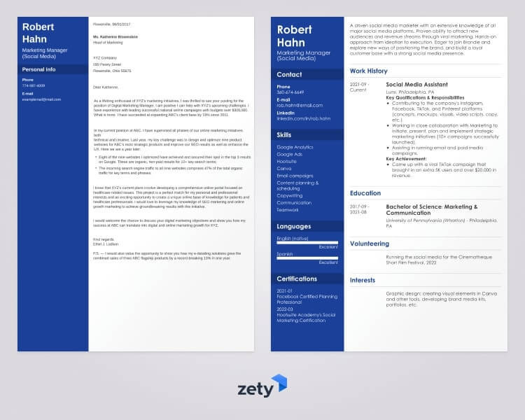
Plus, a great cover letter that matches your resume will give you an advantage over other candidates. You can write it in our cover letter builder here. Here's what it may look like:
See more cover letter templates and start writing.
Key Takeaway
So now you know exactly what a CV should look like. Here’s a quick recap to refresh your memory.
- A good-looking CV needs to have a good layout. Make sure you’re fonts, margins and spacing are all set correctly.
- A good curriculum vitae is short. 1–2 pages is the limit unless you’re writing an academic CV.
- Some things should never appear on a CV such as your photo, personal information or spelling mistakes.
- Choose the right CV format for you and structure your CV accordingly.
About Zety’s Editorial Process
Our editorial team has thoroughly reviewed this article to ensure it follows Zety’s editorial guidelines. Our dedication lies in sharing our expertise and providing you with actionable career advice that offers you real value. Every year, the quality of our content attracts 40 million readers to our site. But that’s not all – we conduct original research to gain a detailed understanding of the labour market. We take pride in being cited by top universities and leading media outlets in the UK and worldwide.
Sources
- Chelsea Rye, Design 101: White Space
- Aaron Lawrence, 26 Common Resume Mistakes That Will Lose You the Job
- Action Words to Use in your Résumé and Interview Answers | Stephen M. Ross School of Business, University of Michigan
- Hard skills vs. soft skills | GCFGlobal.org
- Job Help, Getting through Applicant Tracking Systems


![Graduate Cover Letter Examples [20+ Expert Tips]](https://cdn-images.zety.com/pages/graduate_cover_letter_example_uk_2.jpg?fit=crop&h=250&dpr=2)